For designers Compositions
Overview
Compositions such our spot and scenic illustrations can be created by arranging buildings, objects, characters and iconography. These visual elements can be used to tell stories in a editorial setting where more detail is needed and space permits.
Creating layered scenes
- Background colour representing the sky with a skyline overlay (simple silhouettes of buildings or trees).
- Rectangle representing the start of the horizon line, grounded relevant buildings, trees or other scenery. This layer should be kept monochromatic and knocked back using lighter tones and/or a white sheer overlay set to 40% opacity.
- The foreground tends to include characters and relevant objects depending on subject matter. If there is no need for characters, add buildings or trees. Use more saturated colours on this layer so the subjects stand out.
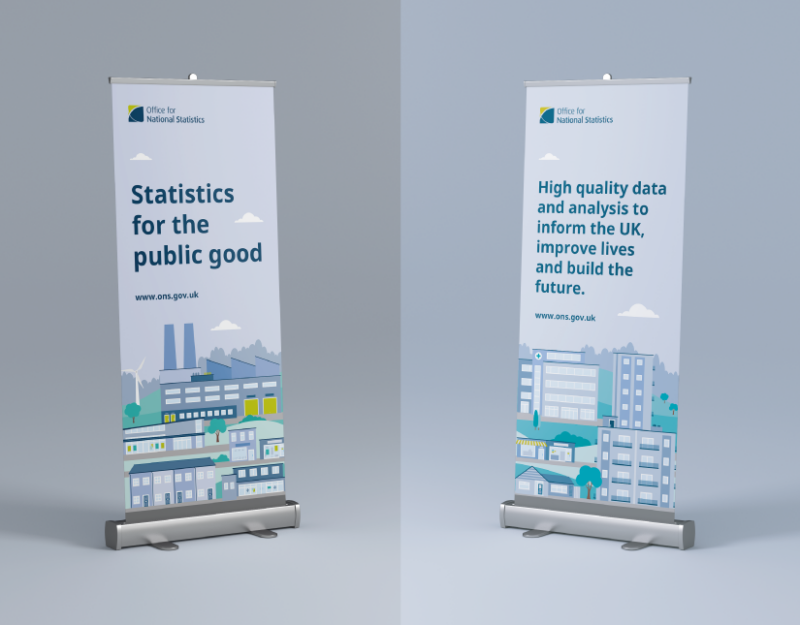
When creating scenes to fill taller dimensions (see below example), use hills to create depth - allowing the different levels to fill out the space.
Tips for creating scenes and spot illustrations
Don’t combine icons to make illustrative elements. Let the content guide you when deciding whether to use illustrations or icons. More sensitive or complicated topics would be best supported using icons or no imagery at all.
When using icons alongside illustrations, sit them within a circle to help stand out and you can use dashed lines to connect them to the relevant detail within the illustration - the lines should be sat behind the subjects and match the line weight of 6px, dash size of 8px and gap of 14px (these are based on a 1080px x 1080px artboard)
When using our colour palettes within illustrations, use different tones to portray dimension and create depth (stick to round numbers when adjusting the tone of each colour, i.e. 10%, 20%, 30%, etc.).