Digital products Emails and newsletters
Overview
We use email to communicate with internal and external audiences.
For a small internal audience, we use standard Outlook emails formatted with a set typeface and including a professional email signature.
For a wider external audience, we use GovDelivery to send corporate information and newsletters. There is a set of templates available for these HTML emails.
Writing Outlook emails
Typeface
Our default font for writing emails is Arial, at a minimum of 12-point font size, to meet accessibility requirements. The size can be increased to 14 point if needed.
Use the "automatic" font colour and avoid using italics, bold or all capital letters.
Signatures
Internal ONS colleagues can view guidance on how to format and set up your email signature (opens in a new tab)
HTML templates
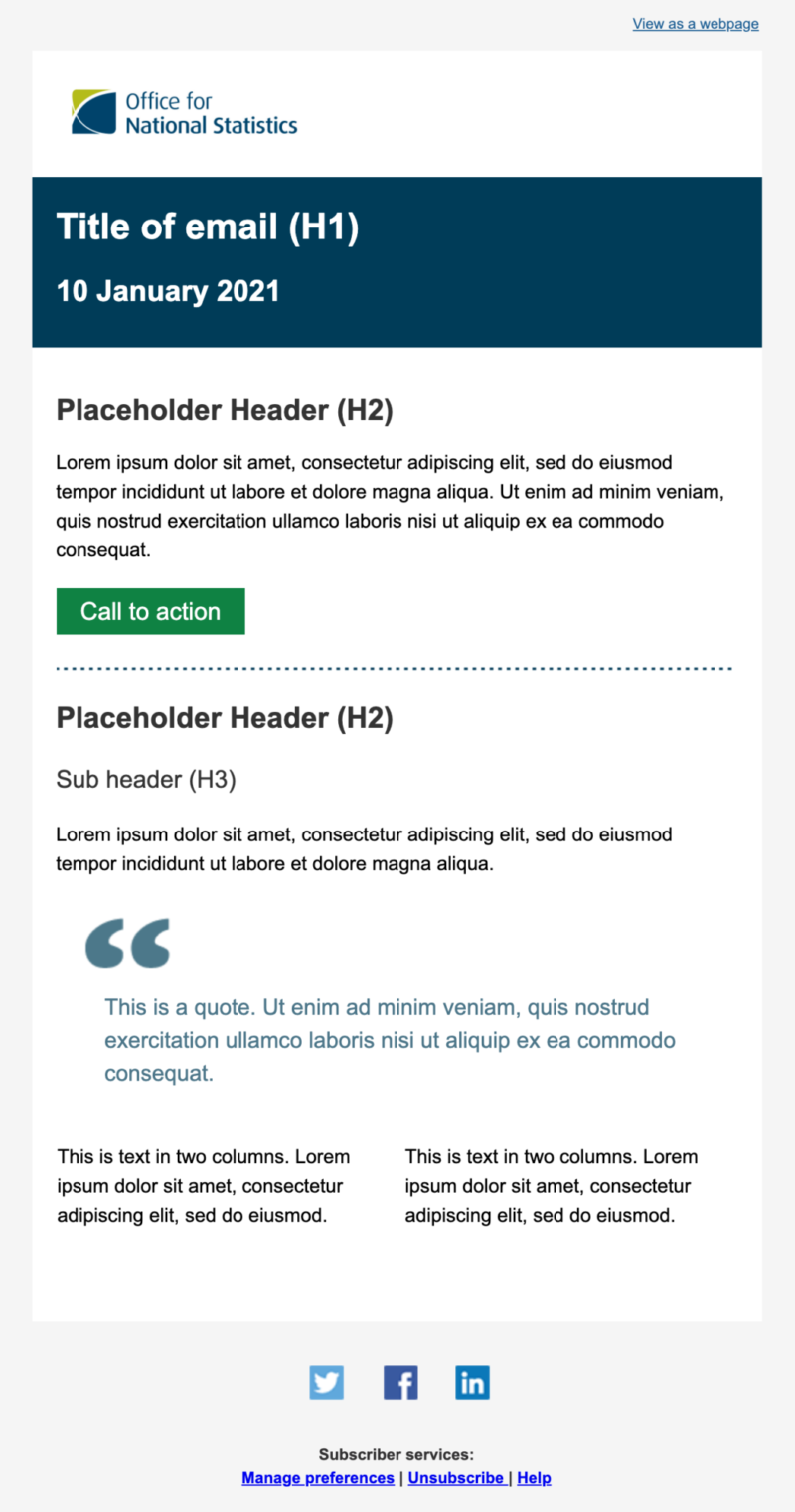
We have a set of default templates for official corporate emails in GovDelivery (opens in a new tab)
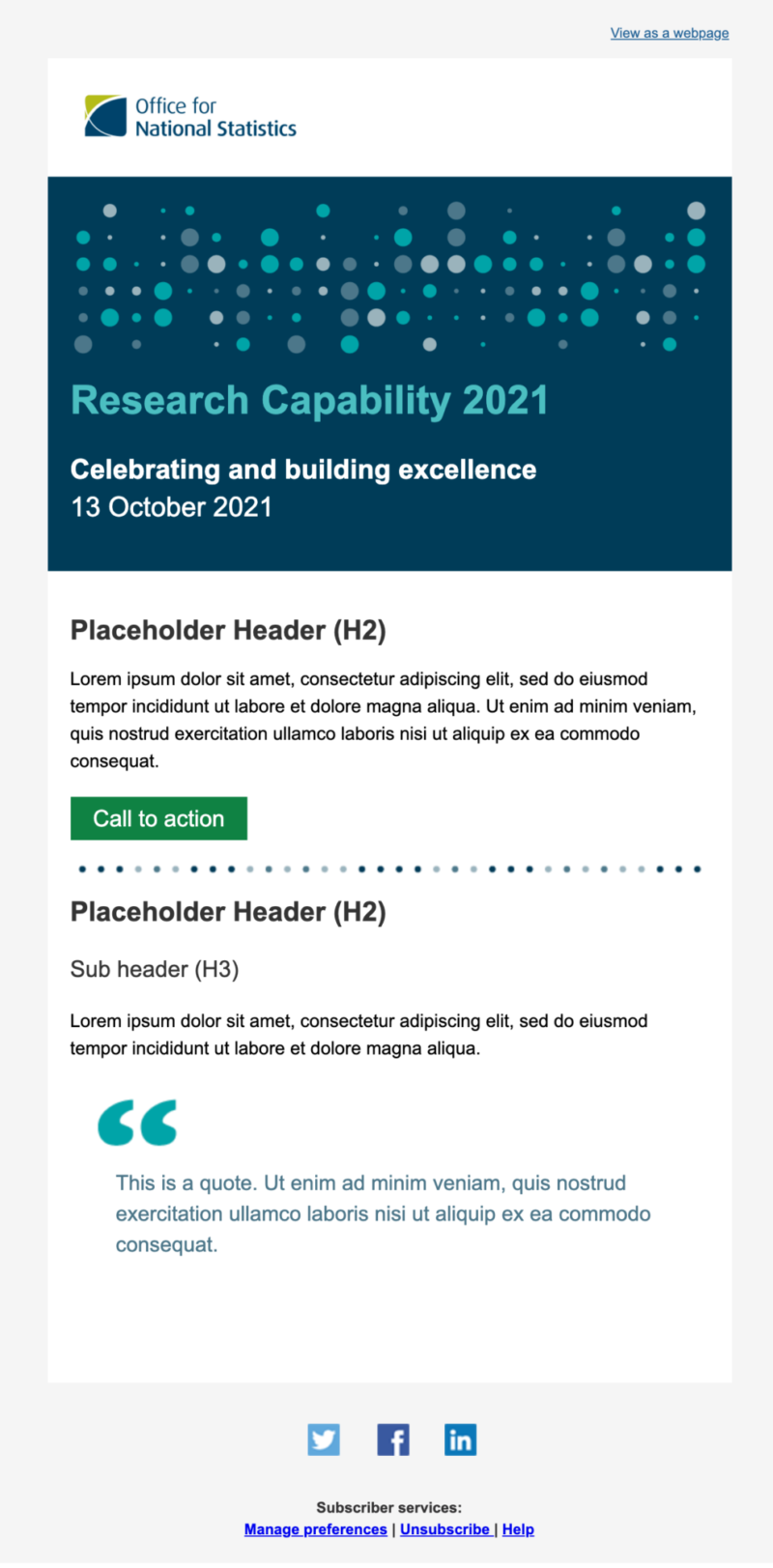
Other GovDelivery templates are used for internal communications, such as newsletters, which have been adapted from the main Office for National Statistics (ONS) template.
All external facing HTML emails should follow ONS branding.
If you need access to GovDelivery or have a question about email templates, email external.affairs@ons.gov.uk (opens in a new tab)
Formatting HTML emails
The main principle is the simpler, the better. The clearer the content, the easier your message is to understand.
Email technology is supported differently across different email clients, which can result in an email displaying one way in Outlook and another in Gmail. For this reason, it is best to not rely too much on images or complex layouts, as they may not look as intended.
Keep content to one column ideally, around 600 pixels (px) wide. This also makes it more straightforward when displaying on mobile.
With your email content you should:
- use a heading structure
- left-align text
- use font that is 16 pixels or larger for body text
- ensure there is a way to view the email in a browser – in GovDelivery you can use the macro [VIEW_THIS_URL]
To avoid issues with text not displaying properly on some devices, always use our alternative typeface, Arial.
Imagery and styling
You can use images to add visual interest, but do not rely on them – they often fail on different email clients and browsers. Avoid using images of text and instead use HTML text (which can be read by screen readers). Ensure your content still makes sense even if styling images do not display.
For external emails, the ONS logo should be full colour and sit at the top left of the email on a white or light background. The size should be no bigger than a third of the column width.
We use a coloured bar with white text for the title and date of the email. Night blue is the default ONS style. For internal emails or in specific cases, such as census, you can use other brand colours.
Before using a colour combination, check it meets the WCAG 2.1 AA requirements using the WebAim colour contrast checker (opens in a new tab)
Accessibility
Litmus (opens in a new tab) is a (paid for) tool you can use to test out emails on different clients and browsers. You can also find helpful guidance on creating accessible emails on the Litmus blog (opens in a new tab)
There are many useful links in this GitHub repository on email accessibility (opens in a new tab)
Examples of GovDelivery templates

