Digital products Social media design
This page uses animated images, if you would like to turn them off select “Disable animations”.
Select state
Overview
We create illustrations, charts, quotes and animations to support messaging for the official Office for National Statistics (ONS) social media accounts on:
- x (opens in a new tab) (opens in a new tab)
- Facebook (opens in a new tab) (opens in a new tab)
- LinkedIn (opens in a new tab) (opens in a new tab)
- Instagram (opens in a new tab) (opens in a new tab)
Where releases require social media support, the content is provided by the social media team. Promoting and explaining our statistics on social media helps us to reach a wider audience. Graphics help support the message, but it is important to first think about what information we want to get across through clear, concise text.
We work on these four different types of social content:
- regular releases (business as usual)
- market-sensitive releases
- bespoke (trending topics and events)
- marketing campaigns
Find out how to apply house style, personality and tone of voice to ONS social media content in our guide to writing for social media (opens in a new tab) .
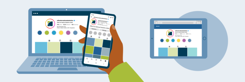
Types of graphics
We supply different content styles depending on how we intend to meet our users’ needs. This will be determined by the Social Media team working in collaboration with the Business Area.
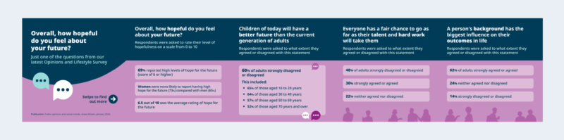
Posts and carousels
Posts are our most common type of graphic and can be published on multiple channels. When a release requires storytelling or a more detailed explanation, we spread the content across several graphics that seamlessly link together in a carousel.
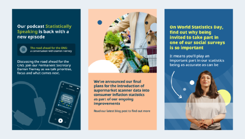
Stories
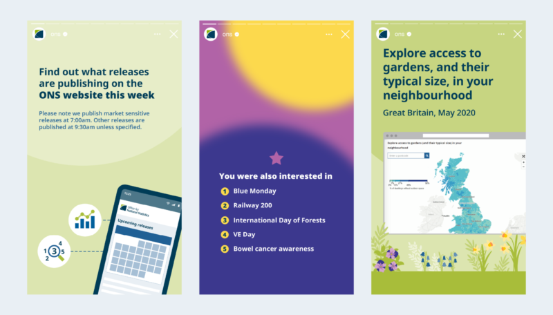
We create story graphics for Instagram and Facebook that can include interactive quizzes, polls and demos of interactive tools. Stories only last 24 hours but we have a highlight reel on Instagram where they can stay permanently if they continue to add value.
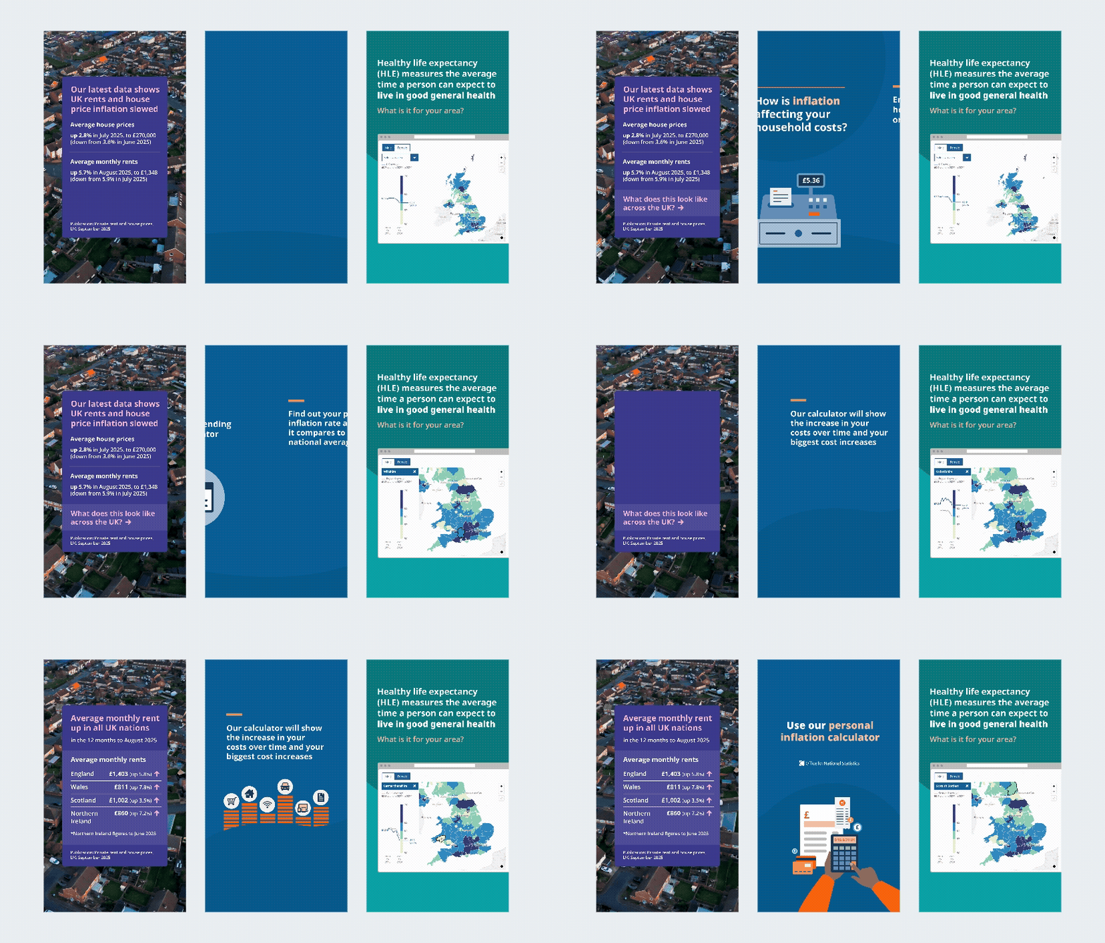
Explainer videos
We provide motion graphics, such as animations and videos to explain complex concepts and help bring stories to life. We should use them as a device to help tell the story rather than just to catch attention. We should also keep them simple, without exaggerated transitions or movements.
The Video team creates content such as talking heads videos explaining specific releases or concepts, along with marketing campaigns. Outputs created by the Video Team can also be published on our social media channels. More information about working with the Video Team can be found in the videography guidance (opens in a new tab) .
Animated charts
Motion graphics can include simple animations of charts or illustrations to take users through the story. Provide these as GIFs, to keep the file small. If you are recording the content before its release, you can currently only record it as a GIF. If you are recording the content after its release, you can record it as an MP4, as long as the size remains under 15MB. It is possible to pause MP4 formats and track them through analytics.
Screen recordings
We also create screen recordings demonstrating interactive charts and tools. Before starting, Social Media team normally direct us on what the recording needs to show. We us QuickTime to take screen recordings of articles and Adobe express to export it as a GIF. Keep these to under 15MB to ensure they load quickly in the feed. When needed for Instagram and Facebook, they should be in our reels template and supplied as MP4 files.
Reels
The team can produce reels more quickly as they usually require more basic animation of text and image.
Reels are often an animation or screen recording to support content that may benefit from more visual storytelling. The Design and Social Media teams work together to plan and produce these, so we need to allow time to do this.
Consider whether the value of creating a motion graphic is proportionate to the effort needed.

Formats and sizing
We supply post graphics for Facebook, Twitter and LinkedIn that all have the same 1:1 ratio. When supplying graphics for Instagram, we use a portrait format that is optimised for both the feed and grid. The Social Media Team will determine which content will be published on the appropriate channels.
Social media formats
When we create graphics for stories we leave space where the platform’s user interface will be. We use the following artboard sizes when publishing on social media.
| Channel | Artboard size |
|---|---|
| 1080px by 1350px | |
| LinkedIn, X and Facebook | 1080px by 1080px |
| Stories, Reels and screen recording | 1080px by 1920px |
| Thumbnails for Reels | 1080px by 1920px |
| Video thumbnails for X | 1080px by 1080px |
| Thumbnails for YouTube | 1280px by 720px |
Add bleed to the background colour to avoid white borders when exporting graphics from Adobe Illustrator.
Layout
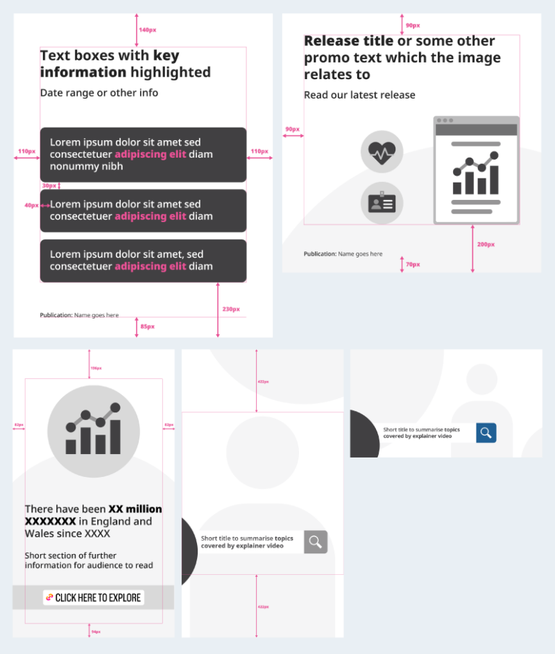
We use the following spacing within LinkedIn, X and Facebook graphics:
- padding at the top is 140px
- padding at the left and right sides is 110px
- padding at the bottom is 230px
We use the following spacing within Instagram graphics:
- padding at the top is 140px
- padding at the left and right sides is 110px
- padding at the bottom is 230px
The publication title sits 85px from the bottom of the artboard. If creating a carousel with the same data source across all graphics, the publication is only needed on the first graphic.
Style elements
All graphics should follow relevant guidance set out in the brand elements pages. Specific details are noted in the following sections.
As we publish data on sensitive topics, always consider whether it is appropriate to include imagery. Sometimes a chart or text can convey the message by itself. For sensitive subjects we include a trigger warning box on the graphic.
All graphics and animations, which contain data, must include the source publication name at the bottom.
Typography
Ensure the message fits the space available and is not too complex. If needed, ask for the content to be simplified to optimise it for social media.
Text should:
- be large enough to be easily read on both desktop and mobile screens
- be left-aligned and not justified
- use Open Sans, our primary brand typeface (opens in a new tab) , with Set 1 turned on in Opentype settings
- use an accessible colour contrast with the background
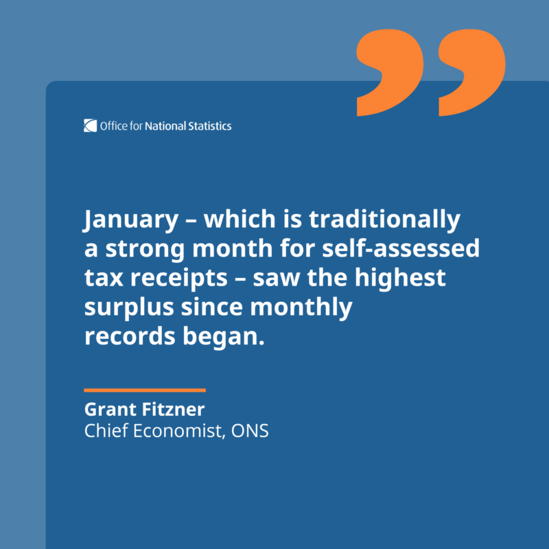
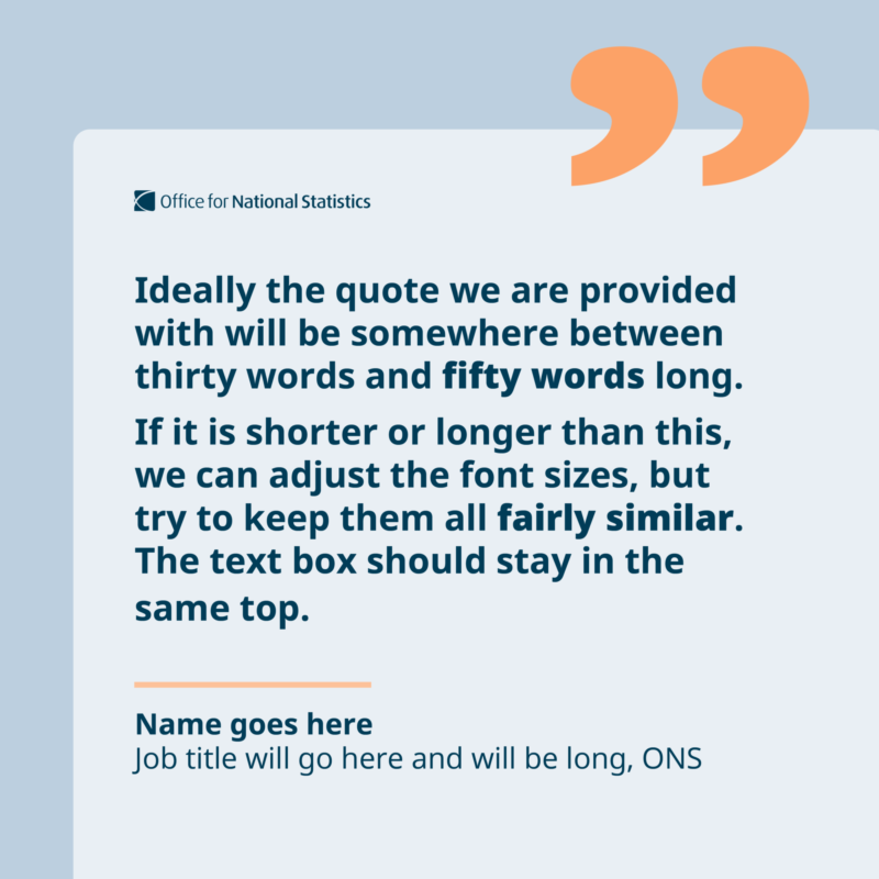
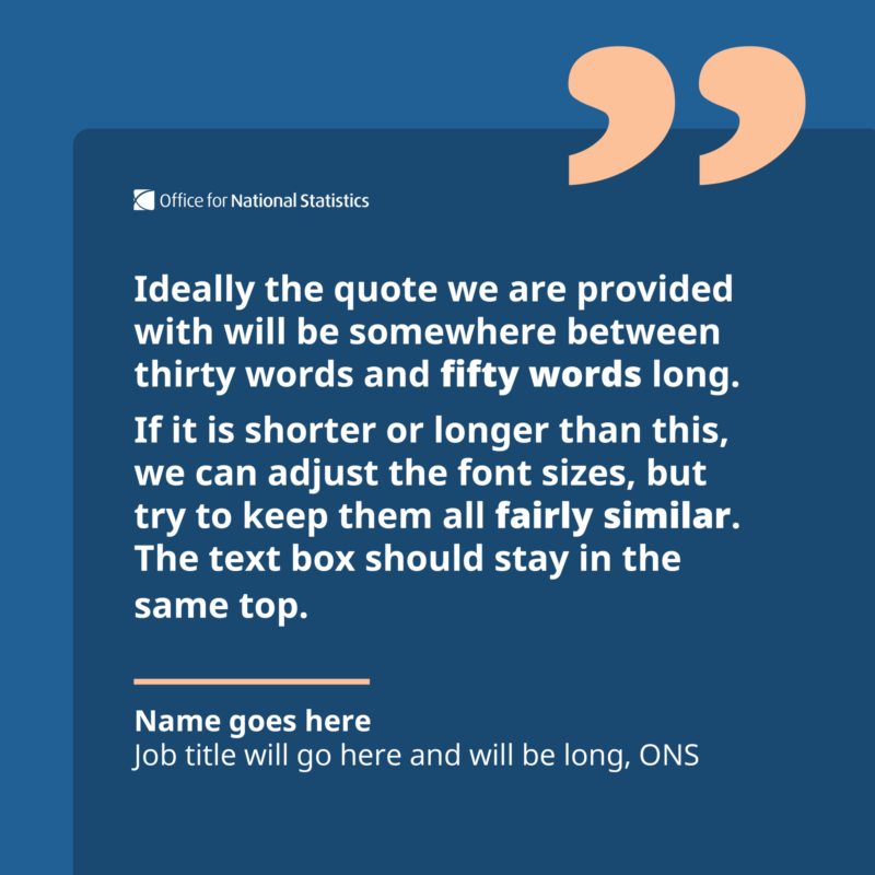
For quotes, we advise no more than 50 to 60 words for engagement and readability purposes, and there should only be one quote graphic per thread for standard bulletins. When the publication being promoted contains multiple quotes, you can use more than one quote in the thread. An example of this is the Instagram carousel (opens in a new tab) promoting the article Student voices: experiences of the rising cost of living (opens in a new tab) .
We use the logo on the quote graphics as they are often embedded in articles and Media Relations Office use them as statements from the ONS.
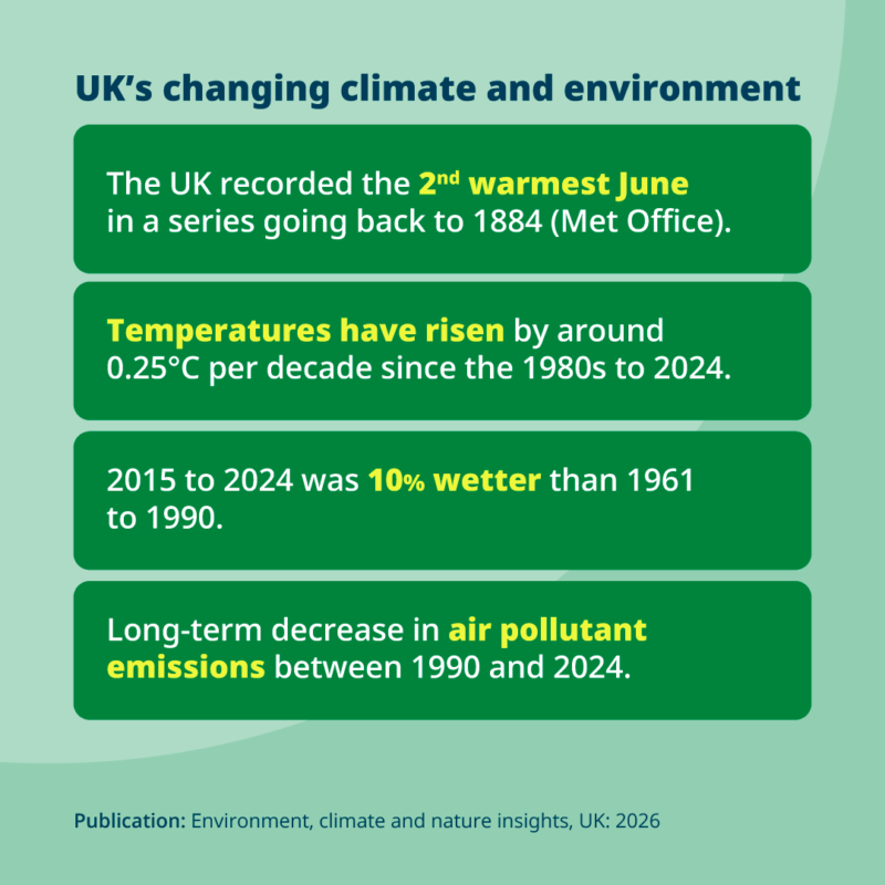
When using text boxes, padding should be 40px around all edges with a corner radius of 20px. Gaps between text boxes, when using them as lists, should be 30px.
The following default text styles and sizes have been set in our templates:
| Text type | Weight | Default text size/line height | Minimum text size/line height | Maximum text size/line height |
|---|---|---|---|---|
| Heading | BoldBold/Extra-bold | 58px/70px | 48px/58px | 62px/74px |
| Secondary text | Semi-bold | 42px/50px | 36px/42px | 44px/52px |
| Body copy (including lists) | Semi-bold (highlighted words bold) | 42px/50px | 36pts/42pts | 44pts/52pts |
| Publication name | Regular | 24pts/29pts | Default | Default |
| Quote text | Bold | 44pts/52pts | 40px/50px | 58px/70px |
| Quote name and job title | Bold/Regular | 36pts/42pts | Default | Default |
| Big number | Extra-Bold | 120pts/150pts | 160px/190px | Default |
| Big number unit, e.g. % | Bold | 80% of big number size | 80% of big number size | 80% of big number size |
Charts
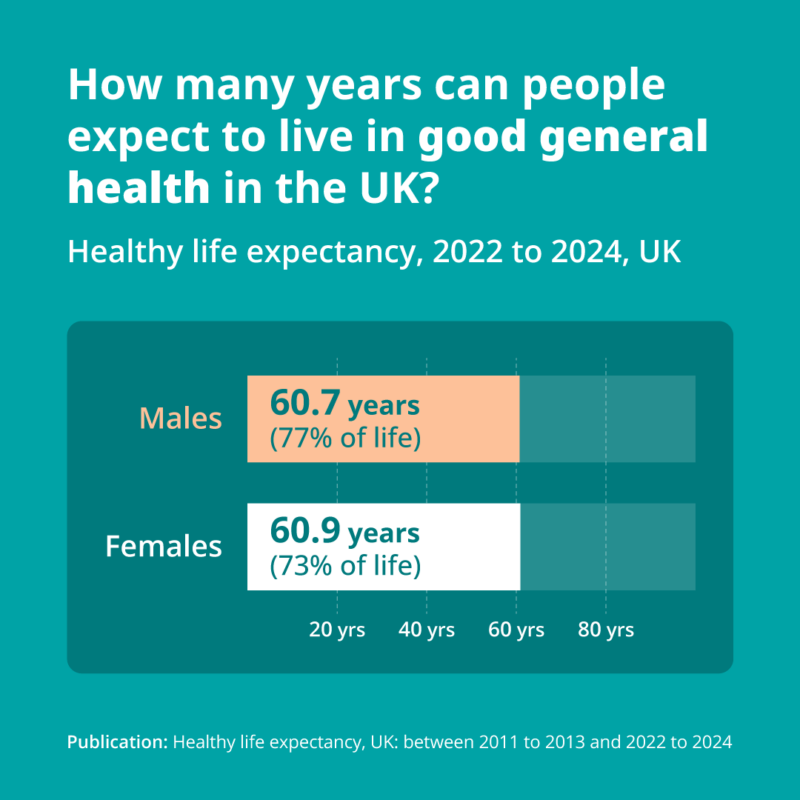
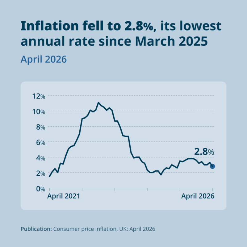
When using charts on social media, keep the focus on the data and keep them simple; any supporting imagery is secondary. We generally only create bespoke charts that do not already exist on our website. We can adapt existing charts, such as reducing the number of categories, or simplifying the information shown.
In many cases, it is suitable to use a branded version of the chart on the ONS website. This is done by the social media team, following the guidance on images for social media (opens in a new tab)
All charts in our social media graphics should follow the general principles in our data visualisation guidance (opens in a new tab) . We may deviate slightly from specific guidance, such as simplifying what is shown, in order to keep charts engaging and understandable on social media.
For the text in charts:
- display it horizontally so that it is easy to read
- reflect the category labels in the title, where possible, to avoid repetition and clutter
- make it no smaller than 28 point
When designing a chart:
- use a 20px corner radius box behind to frame chart elements with 50px padding around all edges
- only use non-standard shapes if it does not detract from understanding the data
- simplify the axis labels as much as possible by taking out some of the points
- avoid footnotes – use annotations if extra information is needed
- directly label the important data points
When using percentages in charts:
- use ghost bars to represent 100%
- use grid lines where we "zoom in" on data
Please sense check any bespoke chart with another digital designer before uploading them to share point. If another digital designer is not available please ask a member of the Data Visualisation team...
Photography
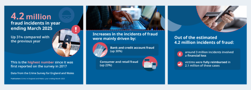
When you are using photography for social media please see the photography (opens in a new tab) guidance section of our brand guidelines. This carousel example shows the three different ways we frame photography for social media: photo in a circle, photo on one half of the page or cropped.
Colours
We follow our guidelines on colour usage when creating combinations for our graphics to ensure all content is accessible and on brand. You can find more information on our colour guidance page. (opens in a new tab)
In line with W3 guidance on colour contrast (opens in a new tab) , graphics should use accessible colour combinations. Exceptions are where elements are purely decorative or added as background texture.
Themes and palettes
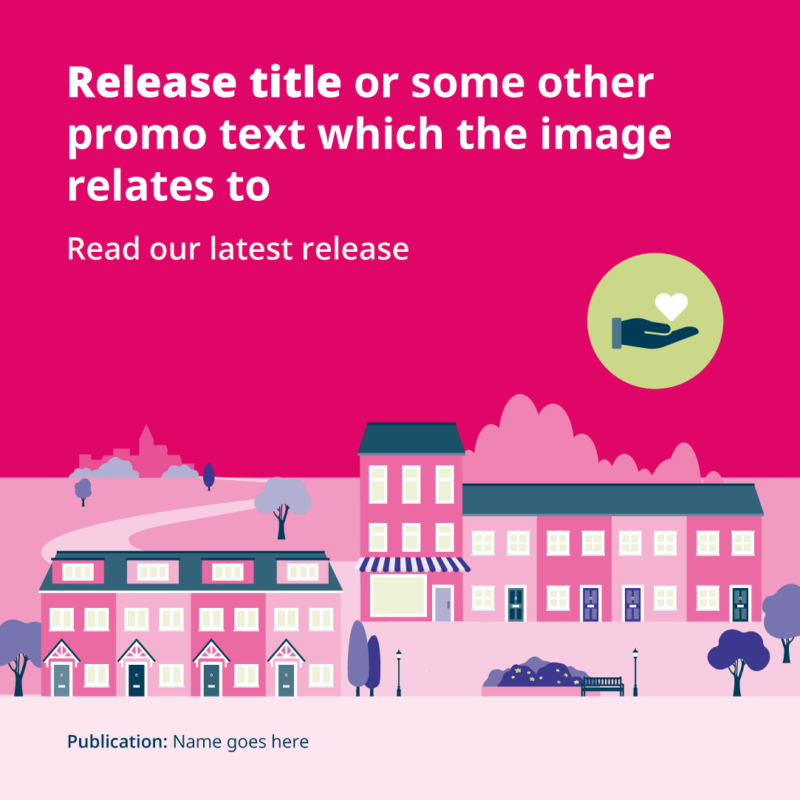
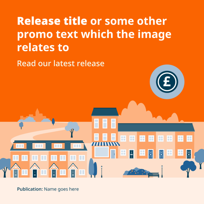
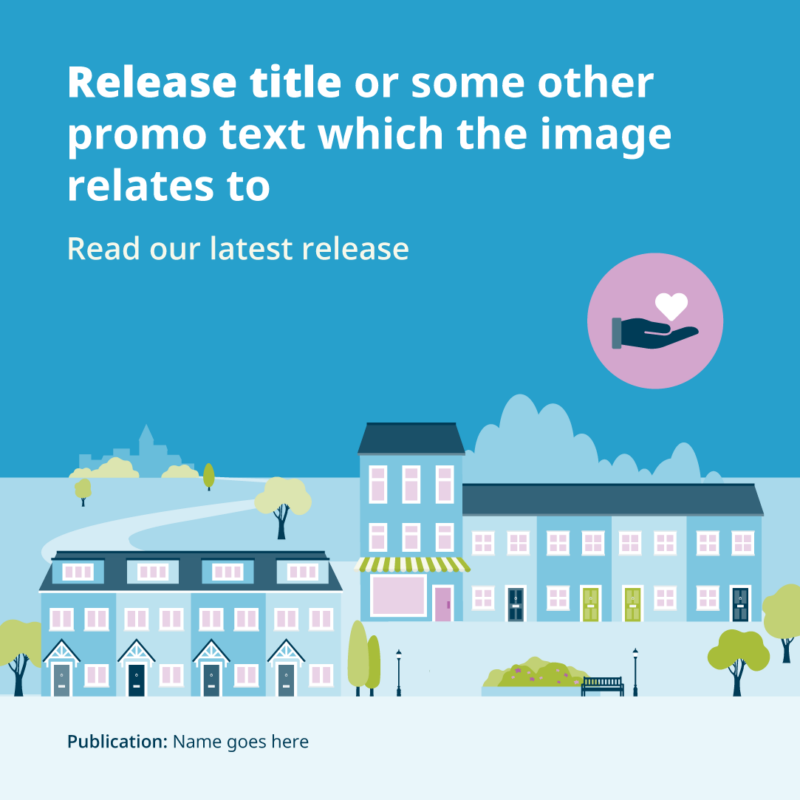
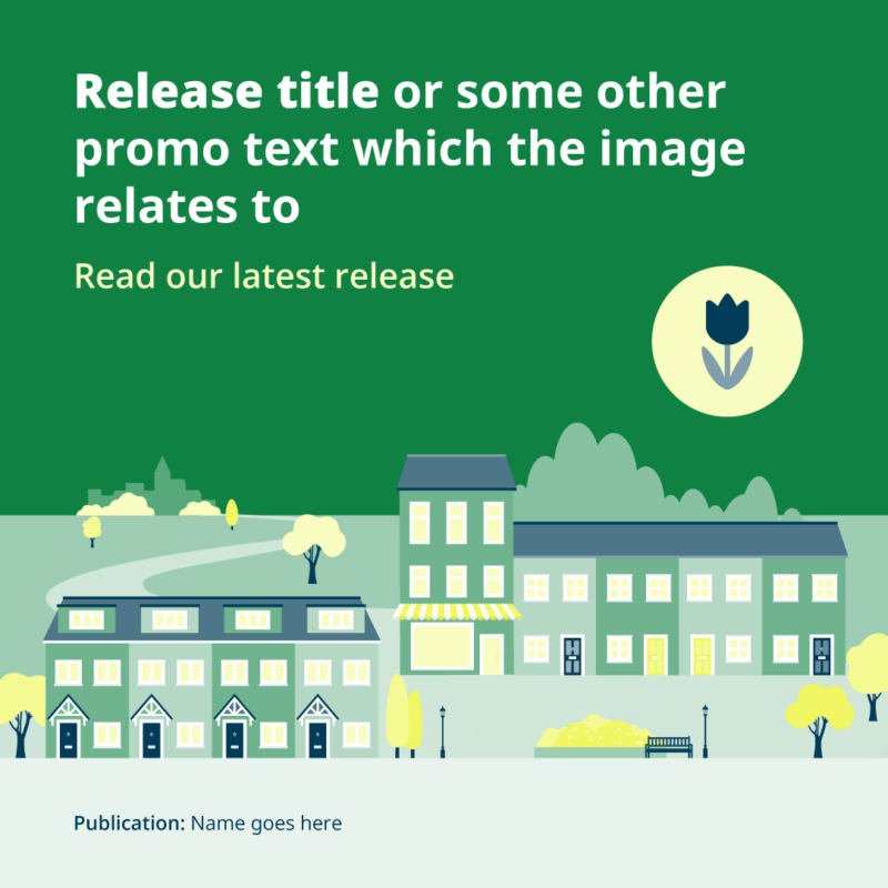
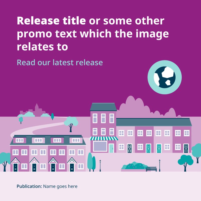
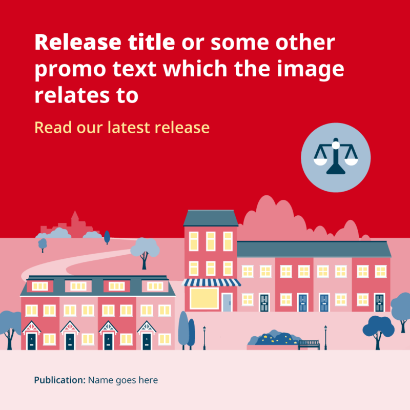
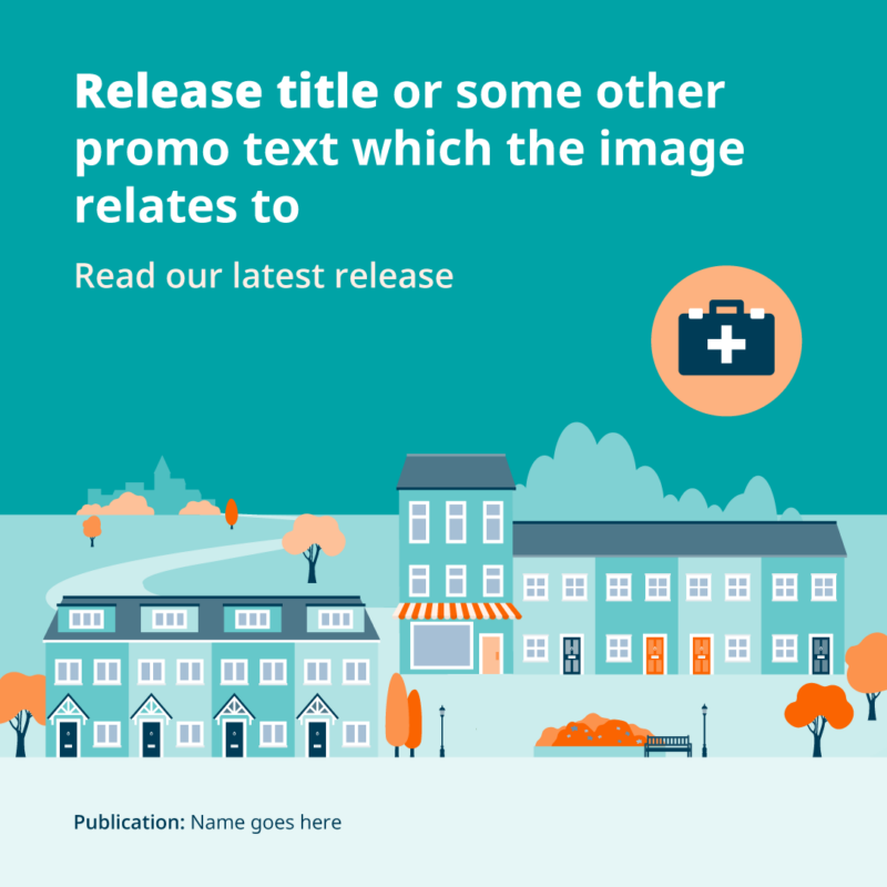
We use our core ONS colour palette for our corporate communications. For all our other content we have developed specific colour schemes for different themes to distinguish and identify the various topics that the ONS covers.
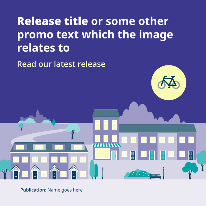
Some themes may have multiple releases within the same category, such as economy. These still follow the same scheme colours but have their own identity using tints and colour combinations. These have been defined and are in our social template set.
Tints and shades
We use tints to ensure the feed has tonal variations and to differentiate between content when they sit within the same theme. Elements such as text and chart boxes and background circles should be tints or shades of the theme colours to highlight or frame content.
Using branding from other organisations
We do not often include branding from other organisations, but we can use it if appropriate when creating graphics for awareness or topic days.
We can do this by:
- introducing the logo in isolation at the start of a thread within our design template, such as for our University Mental Health Day Twitter campaign (opens in a new tab)
- using styling and assets that are supplied by the organisation to introduce the day, such as for our International Women's Day Twitter campaign (opens in a new tab) and our World Statistics Day Twitter campaign (opens in a new tab)