Corporate documents Survey material design
Overview
The Office for National Statistics (ONS) collects data through large-scale business and voluntary social surveys.
For more details on specific studies and surveys, visit the ONS Our studies web page (opens in a new tab) .
All survey guidance has been developed in partnership with the ONS Social Surveys Transformation team and is based on user research conducted by ONS and best practices from GOV.UK (opens in a new tab) .
Designing survey materials
To build strong brand recognition as the leading producer of statistics, it's important to keep consistent messaging and design across all survey suites and supporting materials, including booklets, leaflets, and postcards. This recognition builds trust, enticing more people to complete and participate in our surveys.
To request a survey letter, survey suite or supporting material, submit a design request form to the Design team (opens in a new tab)
Text
Bold and semi-bold
Semi-bold should be used for:
- URLs (both loose and in the middle of text)
- phone numbers (both loose and in the middle of text)
- call-out / pull-out text / highlighting content that is separate from body text
Bold should be used for:
- call-out / pull-out text / highlighting content that is separate from body text (must be specifically requested by the client)
User research has shown that when most body text is black (95% black), any other colour used for strong highlight jumps out and is perceived as different by the average user, so avoid using black semibold and opt for accessible colours that stand out.
See colour palette (opens in a new tab) and accessibility chart (opens in a new tab) for further information.
Titles
Heading 3 in Night Blue is from our paragraph styles and should be used as the standard letter title. The title sizes should try to follow our default paragraph styles which have already been pre set to 14pt Open Sans, stylistic set 1 with 18pt line-height.
See our typography page (opens in a new tab) for more information.
Body text
Should also follow our default Paragraph Styles. That means 12pt Open Sans, stylistic set 1 with 16pt line-height for all body text.
Spacing between paragraphs using the same style should always be 2mm. Between paragraphs of different styles, it should be 4mm.
See our typography page (opens in a new tab) for more information.
If a client's content demands tighter spacing, the letter should be brought before design review so the team can advise how to proceed.
Control code
The control code should be set as 10pt Open Sans semibold, using 70% black. The code sits vertically on the right side of the letter, and the text is right-aligned to the bottom of the margin. Always try to propose to add some form of date to the code to help locate the project. The control code cannot be less than 5mm from the right margin, at risk of being cropped in print.
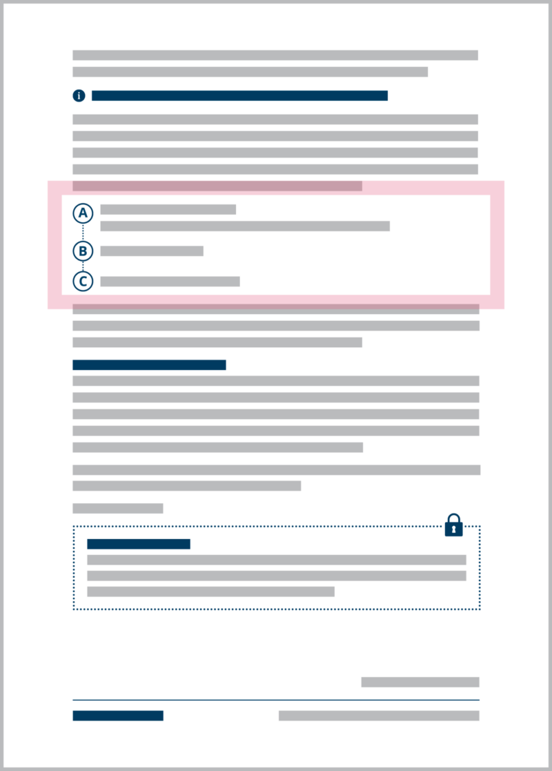
Highlighting content
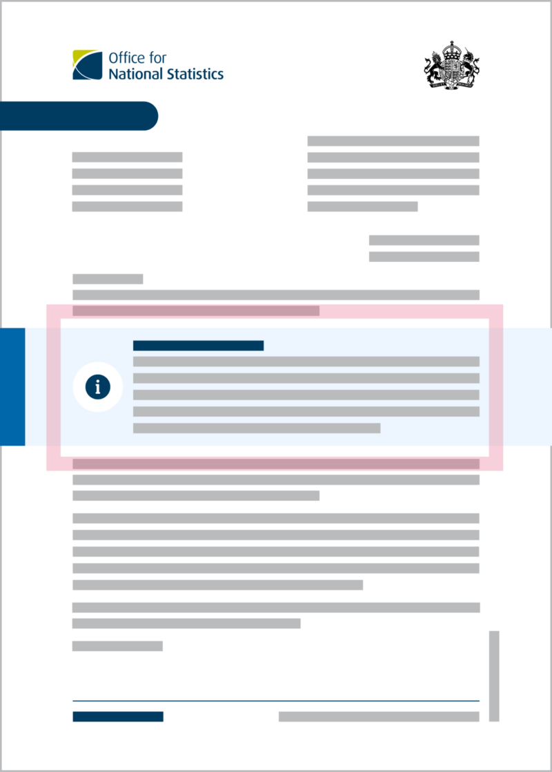
Primary callout box
We use the primary callout box to highlight the important information in a survey letter.
To create this:
- A strip of 100% ocean blue at 5mm width should sit along the left side of the callout box to edge of the page. The strip should also have a 5mm bleed.
- The box should be a 10% tint of light blue.
- Bleed the box to the edge of the page, research shows users find it makes the letter look more official.
- Icons sit against the left-hand side of the margin.
- Icons should be vertically aligned with the paragraph of text it relates to.
User research has informed that icons on the left-hand side are perceived as relevant, but icons to the right are not and can be removed.
On right-to-left languages, the icon should sit on the right, and the content should have the same margins but on the right.
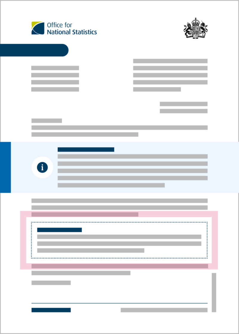
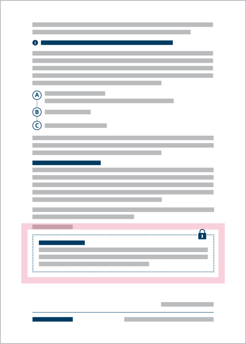
Secondary highlight box
The text box has 5mm padding and is bordered by a 2pt Japanese dot stroke in 100% night blue.
The secondary box can only be used for non-actionable highlights (such as QR code information boxes, confidentiality statements, etc), while the primary highlight box should be used for actions, key information and similar content.
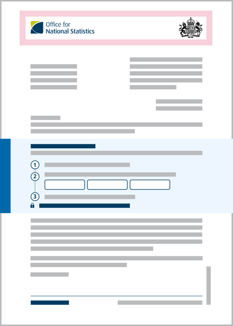
Mail merge and dynamic content
UAC / mail merge boxes or field boxes
These should always have a white background, 100% Night Blue 1.5pt solid border with 1mm rounded corners.
Selection boxes
For things like forms, we use a right-aligned, 10% tint of Night Blue, square box of 6mm x 6mm width.
Address fields
Usually mail-merged, the address fields need to have the tighter leading of 14.4pt to fit at least six address lines within the envelopes' window.
For Social Surveys, the envelopes used are usually the Business-as-Usual Manilla Envelopes supplied by Social Survey Operations and Reprographics. These have a 34mm height of available space for text. Ensure you confirm the correct margins for the product you're designing; envelope templates may differ depending on who produces them.
Month, year, reference and TLA
Some surveys will have information such as Month, year, survey acronym and reference numbers. These should be right aligned, just like the accessibility statement, before the body copy of ‘Dear Resident’. A 10mm top margin in relation to the accessibility statement is ideal, but it can be shortened to a minimum of 5mm.
General survey letter design
Margins
We should always use 15mm top/bottom and 24mm left/right margins for letters and survey materials, with 5mm bleed. This gives the content enough room to breathe and space to make it easier for the user to digest the information.
A tighter margin, no smaller than 15mm left/right, may be used. This has been agreed as the minimum sizes we can use by Reprographics.
A tighter margin should only be used if the client can provide user-research-based evidence that justifies the need.
Social Survey letters for BAU surveys need tighter margins to fit the content. This is not something we can go back to Survey managers to discuss and has been confirmed as a user need (the current content on the letter).
Accessibility statement
The accessibility statement should be to the right side of the address window in the top-right corner of the letter, using 15pt-sized regular text and 18pt leading. Its size should be in relation to the margins of the envelope window. For the Manilla envelopes, the maximum width of the text box should be 70mm.
If a letter doesn't have an address field, the accessibility statement can extend up to the middle point of the page but no further.
Survey banner
The Survey banner, also called “survey sausage”, is used at the top of materials to help easily identify a survey and should have the name of the survey written inside.
It should sit at the very edge of the left-hand page with a bleed of 5mm. It should be coloured to match the surveys’ colour scheme with a height of 11mm, and its text should be 14pt Open Sans.
The right side should be fully rounded, with a space of 8mm between the edge of the right-hand side of the shape and the end of the text inside it. Its width is determined by the length of its content and sits between the ONS / leading logo and the address box if an address box is present.
Despite this guidance being meant for letters in general, the survey banner can be used for branded materials that are part of a suite related to a survey (i.e. leaflets, pamphlets and similar).
Signature sign-off
Avoid putting the signature beside the name of the person signing off. This is no longer acceptable practice.
When separating the name and title in a single line, use an em dash (—) (Insert special character > Hyphens and dashes > em dash). If separating the name and title into two lines, use a comma. Text should be kept as Open Sans regular and 95% black.
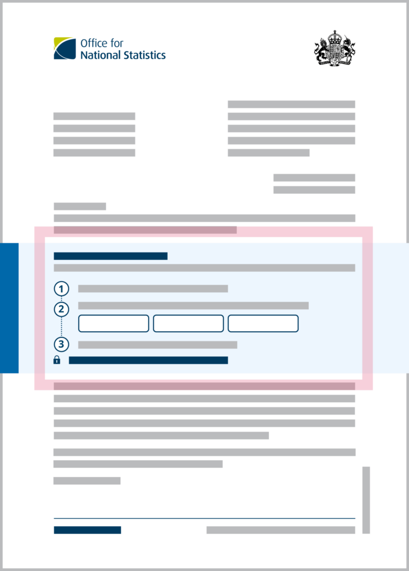
Step-by-steps
We use a step-by-step approach to help highlight instructions and the order of actions a user might need to take. We use this method in the "how to take part" sections within our survey letters.
When presenting a series of actions, the steps should be set as numbers and can be within our primary highlight box to emphasise their importance.
Step-by-steps that don’t include actions should be kept outside of the highlight box and should be listed as A, B or C.
The numbers / letters should sit in a white background circle with a 1.5mm solid Night Blue border, connected by a 1.5mm Japanese dotted line, also in Night Blue. The dotted line should extend to the very edge of the paragraph it's referring to.
Icons can be used as supporting images if needed – these must always be after the text when in action steps.
Our step-by-steps are based on the GOV.UK navigation pattern (opens in a new tab) showing end to end journeys in logical steps.
Icons
Smaller icons, such as Information, Internet/Network and similar should be 5mm in width and always Night Blue. They need an indentation of 7mm tab from the text and should be aligned to the top of the paragraph they refer to.
When using the larger icons, to stay consistent, either keep all icons in a suite with a circle or without (based on our Icon Guidance guidance according to size).
If opting to have the icon within a circle, keep in mind that if the icon is going inside a coloured callout box then the circle should be white.
Mobile phone icon (opens in a new tab) that looks like a smartphone should not be used in the smaller size. User research shows that users could not identify what it was in its smallest size. Opt to use the old phone style icon (to be added to icon library).
Footers
- The footer should feature on all letters.
- The body copy of the letter should be split from the footer by a 1pt line using Night Blue.
- The ONS website or survey URL must be present in all footers.
There should be a gap of 4mm between the horizontal footer line and the text box with the information in for the footer.
Depending on the length of the letter, it may be necessary to add “Page 1 of X” to the bottom of the page.
A page number disclaimer is mandatory for multiple-page letters for accessibility reasons.
If there is no requirement for an address within the footer, the page number disclaimer may go nested to the right of the ONS website, underneath the footer line. If the footer has both address and website, the Page disclaimer must go above the footer line, aligned to the right margin. This sits 4mm above the footer line.
Working with partner brands
Multi-logo placement for partnership letters
When using multiple logos, try to balance them and align them visually on the page, prioritising the ONS logo to come first and sit on the far left.
When using the HM Government crest, this should sit on the far right. Only ONS-run Surveys have permission to use the HM Government crest.
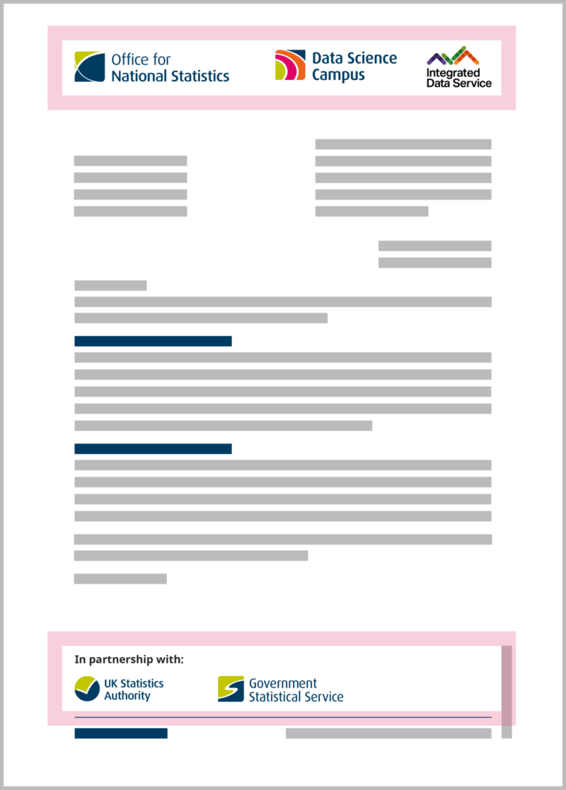
Surveys we do in partnership where we aren’t managing the survey operation and data collection cannot use the HM Government crest.
Partnership brand logos should be added to the right of the ONS logo. Remember each logo's clear zone when placing them beside one another. It may be necessary to make them smaller if their brand guidelines allow.
If the survey includes partnerships and sponsors, partners should be displayed at the top alongside the ONS logo, while sponsors should be placed in the bottom left corner within the footer.
Logos within the footer should be kept at least 10mm from any content beneath them (such as page count and/or the footer line).
As more logos are added to the top header, accommodating all of the logos' whitespace becomes increasingly difficult, and it may be necessary as an alternative option to move the partner logos to the footer.
If the document has multiple pages then the logos within the footer should sit on the last page and identified with the text “In partnership with / Sponsored by”.