Multi-media content Diagrams
Overview
Diagrams are graphics that can help explain information or enhance understanding including:
- process maps
- flow charts
- decision trees
Diagrams can be a useful illustrative tool but can present issues with accessibility and text duplication.
If your content can be published and understood as plain HTML text, a diagram is not needed.
All diagrams published on the ONS website must be created by the Digital Design team. The Content Design team will assess requests and work with Digital Design to advise on the best way to present your content for the user.
Identifying user needs
To use a diagram, there must be a clear user need to visualise a complicated process with multiple elements that relate to each other. Ask yourself whether this need can be met with clearly written text rather than a diagram, as users often find diagrams difficult to understand.
Consider the following:
- what is the message you would be trying to communicate with a diagram?
- are you trying to communicate too much information in one diagram?
By explaining the message as succinctly as possible in the text rather than using an image, you can avoid duplicating content and ensure the website is accessible for everyone.
Design principles for diagrams
Only images created by the Digital Design team will be used on the ONS website. This ensures all diagrams:
- are clear and easy to understand
- have a clear starting point
- follow normal reading direction, from left to right and top to bottom
- use simple shapes and as few different shapes as possible
- have minimal text and annotations
- use colours where the contrast meets Web Content Accessibility Guidelines (WCAG) AA standard (opens in a new tab) – use a colour contrast checker (opens in a new tab)
- do not rely on colour alone to convey meaning
Any diagrams drafted in landscape may need to be redesigned as portrait to fit within the website’s 640-pixel width. Any text displayed on the website will be in a 16-point font size, so use as few words as possible in your draft.
We currently publish all images as PNG. Our goal is to move towards the more accessible SVG format in the future.
All diagrams should also have accompanying alt text (known as alternative text) for accessibility.
For more detail about how we create accessible diagrams in the ONS style and brand, read our diagram design guidance
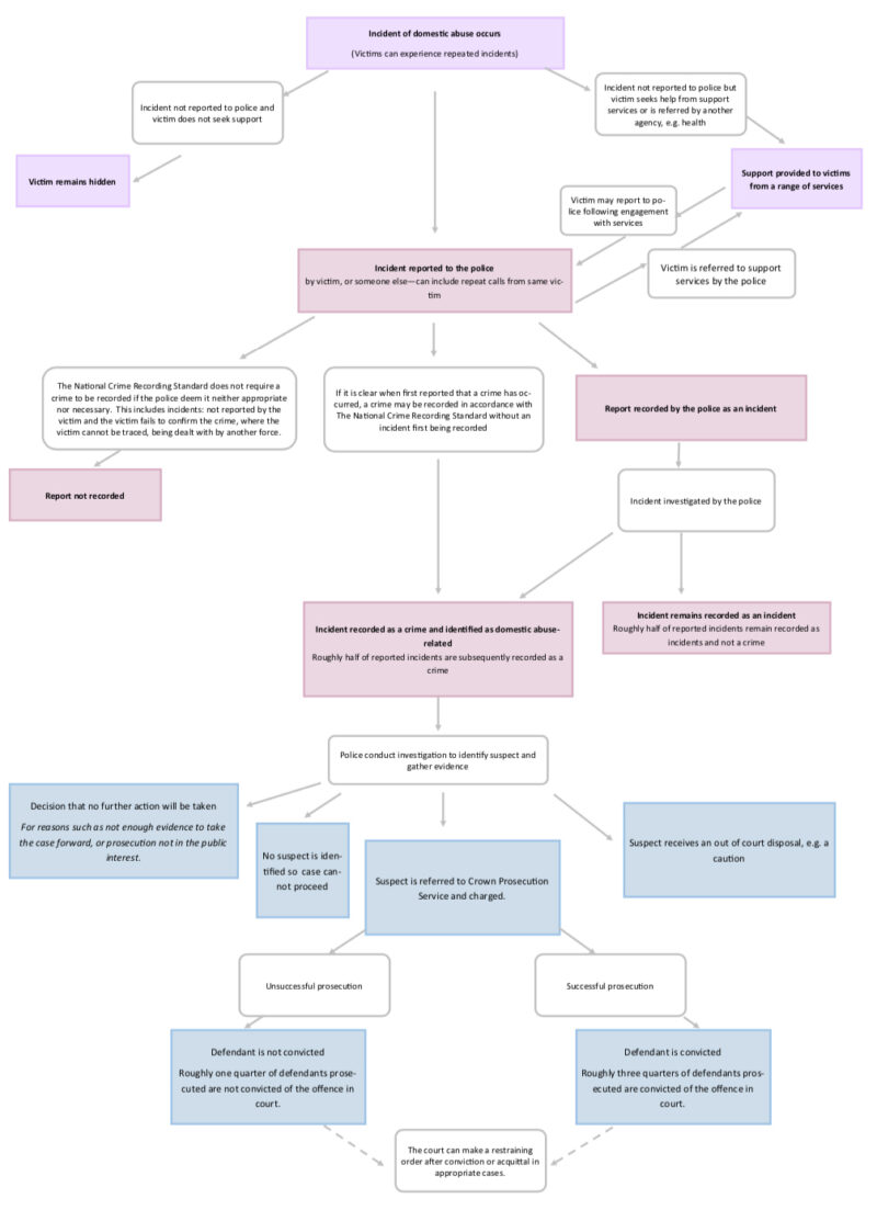
Example of diagram before and after redesign
Before

After
Accessibility
Users of all levels of expertise have accessibility needs and use screen readers and other assistive technology. Accessibility in diagrams is a challenge as assistive technology cannot read the content in images. Those using these tools will require the information to be provided as alt text.
We have a legal obligation to make our content accessible. More information is available in our accessibility statement (opens in a new tab)
Using text instead of a diagram
We recommend using text structured under headings and subheadings instead of a diagram because it means that:
- the content is accessible to more users
- the content can easily be updated
- users can zoom and alter the size of text
- search engines can read the text and display it in search results
- it displays better on a mobile device than an image
Any diagram must add a level of understanding and value beyond what can be conveyed by written text. If your diagram does not have a clear user need, it is unlikely to be approved by Digital Publishing.
Venn diagram example
This diagram could simply be rewritten as plain text which would be clearer and more accessible.
The following conventions are against house style as they are obstacles to accessibility:
- symbols such as “&” and “/”
- directional text
- images and charts without alt text
- superscript after dates such as “st” and “th”
- blank cells in tables
- carousels of images
- walls of text
- text tables
Flowchart example
This diagram could simply be rewritten as plain text which would be clearer and more accessible.
Guide to using the publishing tracker
- Create a publishing tracker on the Publishing Hub.
- Use a market sensitive tracker if your release is market sensitive.
- Complete all the sections and submit your draft tracker.
- Check the preview once you are told that your release has been proofread and built.
- Submit any changes through the change log.
- Send the preview to your deputy director for sign-off.
Once your release has been signed off, it will go into the publishing queue to be published on the ONS website.
Use a table or chart to present data
Diagrams do not include data. If you are trying to visualise something that involves data, it needs to be a chart or a table.
Diagrams should not feature the structure or format of tables. Tables containing data should be built in HTML and tables containing text should be written out as plain text. View our Tables guidance for an example of how to turn a text table into plain text.
If you are unsure whether to use a diagram or a chart or table, contact publishing@ons.gov.uk (opens in a new tab)
Process for publishing diagrams
Once you have identified there is user need to use a diagram, email content.design@ons.gov.uk (opens in a new tab) with:
- the name and date of your release
- the unique reference number (URN) for the publication and, if known, the number of the SharePoint tracker
- the title and the main message of the diagram
- any links or attachments to prototypes or rough sketches you have in an editable format so that text can be manipulated
Content Design will work with the Digital Design team to find the best way to present your content.