For designers Social media design
This page uses animated images, if you would like to turn them off select “Disable animations”.
Select state
Overview
We create simple illustrations, charts, quotes and animations to support messaging for the official Office for National Statistics (ONS) social media accounts on:
We also create graphics for our corporate channel, ONS Focus (opens in a new tab) , and our recruitment channel, ONS Jobs (opens in a new tab)
Writing for social media
Promoting and explaining our statistics on social media helps us to reach a wider audience.
Graphics can support the message, but it is important to think about what information we want to get across through clear, concise text.
Find out how to apply house style, personality and tone of voice to ONS social media content in our guide to writing for social media
Types of graphics
Our graphics can include:
- text
- illustrations
- charts
- bespoke animations
We do not use photography on our main channels.
As we publish data on sensitive topics, always consider whether it is appropriate to include illustrations. Sometimes a chart or plain text can convey the message by itself.
For more information on the templates we use, email ons.design@ons.gov.uk (opens in a new tab)
Typography
Before adding text to a graphic, check if the message can be simplified to fit the space available.
Text should:
- be large enough to be easily read on both desktop and mobile screens
- be left-aligned and not justified, to meet Web Content Accessibility Guidelines (WCAG 2.1)
- use Open Sans, our primary brand typeface
Our text styles and sizes have been set in our templates for different graphics. To request a template, email ons.design@ons.gov.uk (opens in a new tab)
Colours
Our social media graphics primarily use dark background colours with white text, taken from the ONS brand colours.
This is to ensure text colours meet the WCAG 2.1 accessibility guidelines and have a colour contrast ratio of at least 4.5:1 (AA standard) against the background.
We also:
- add depth to illustrations by using tints of our brand colours
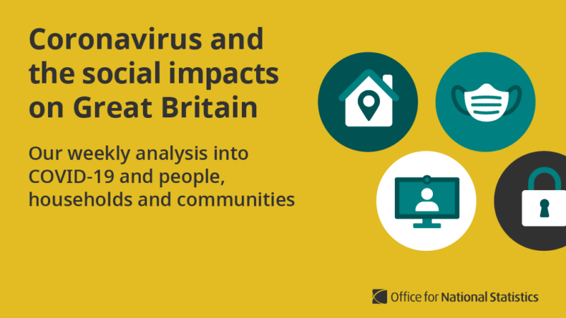
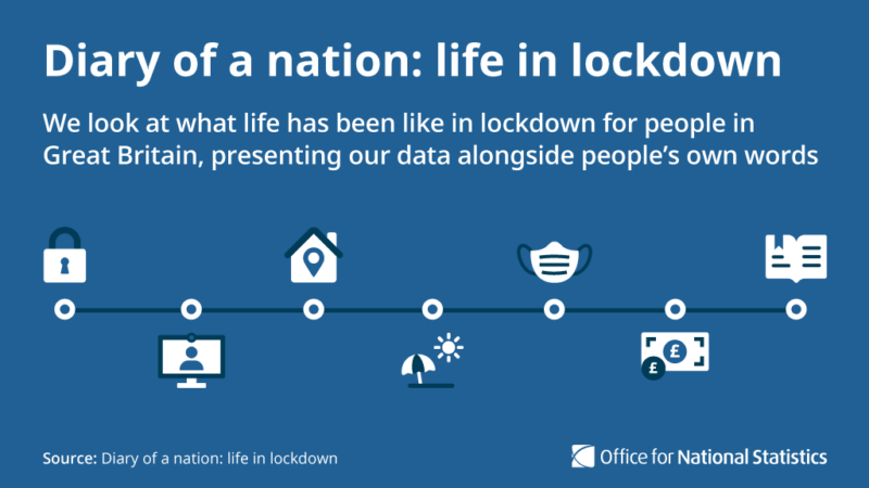
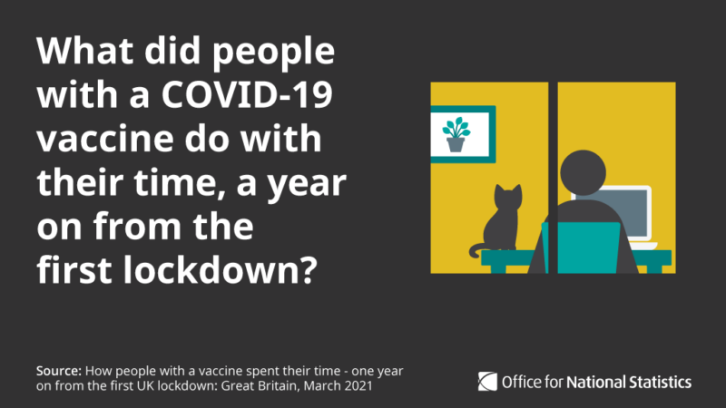
- use specific palette for topic-related graphics to bring familiarity around the topic, for example, yellow, dark grey and shades of teal for COVID-19
- add bleed to the background colour to avoid white borders when exporting from Adobe Illustrator
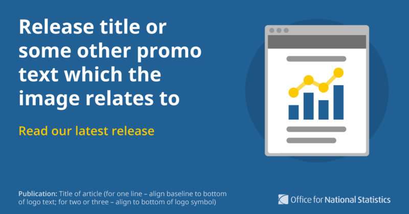
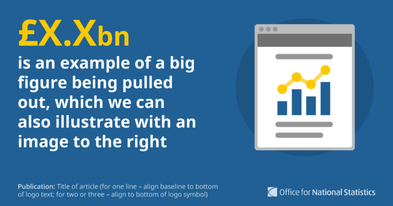
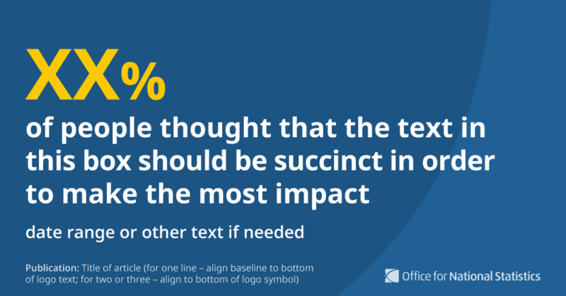
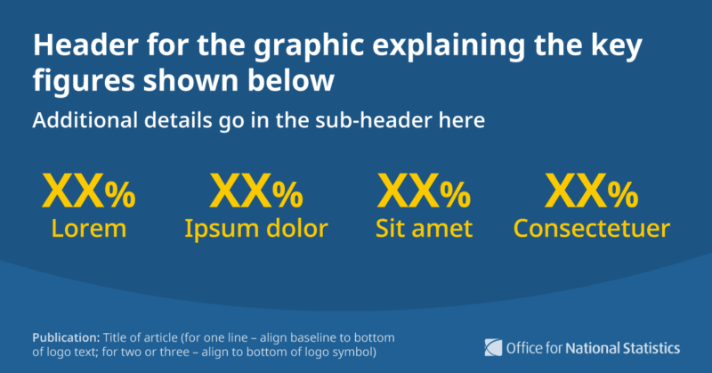
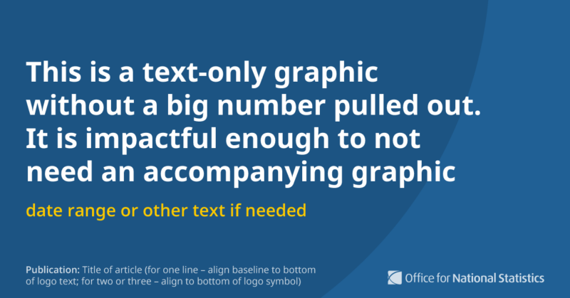
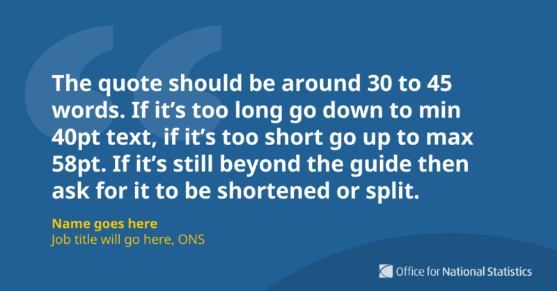
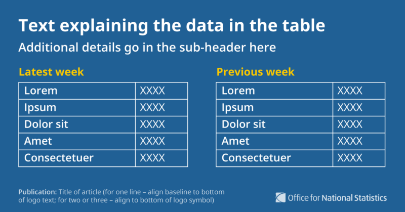
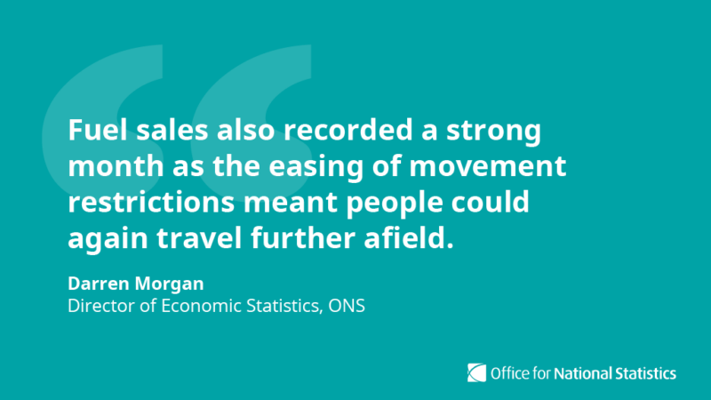
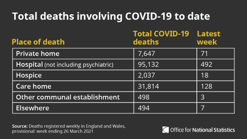
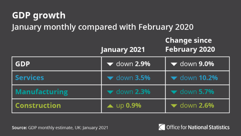
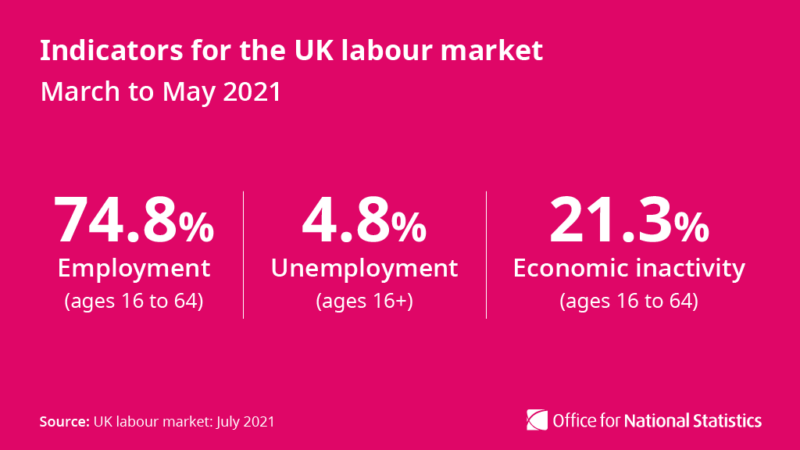
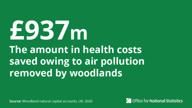
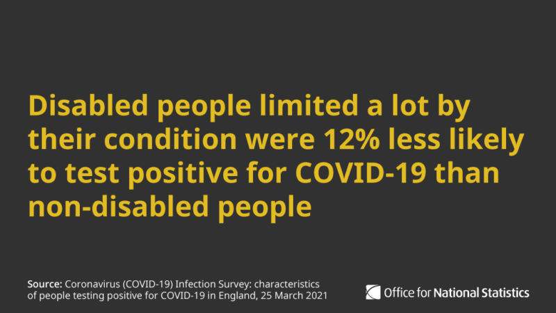
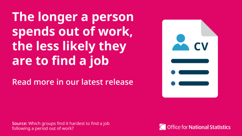
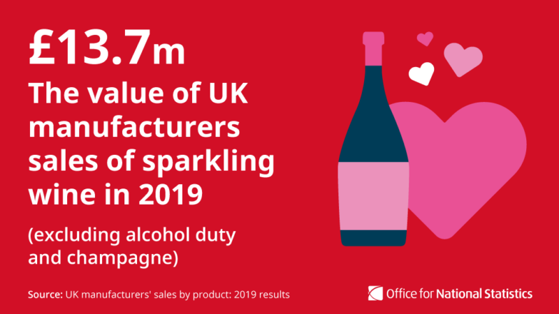
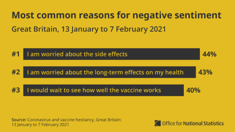
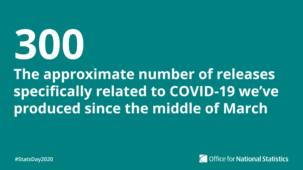
Text-only visuals
We often create graphics containing important figures, quotes, or tables, which can be more impactful than leading with an image.
Topics may be too difficult or sensitive to convey in a simple illustration, so text-only graphics can work in these situations.
These should:
- include the source of the article when quoting statistics, so users can find where the data is from
- use our templates as a basis, but you may need to adjust type styles to ensure the hierarchy is right for the information being conveyed
- always include the person’s name, job title and organisation under a quote
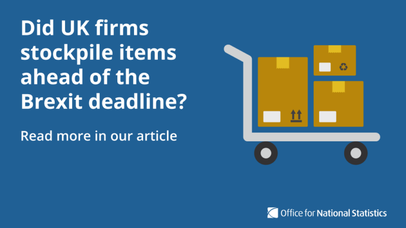
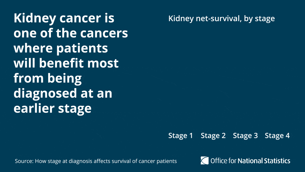
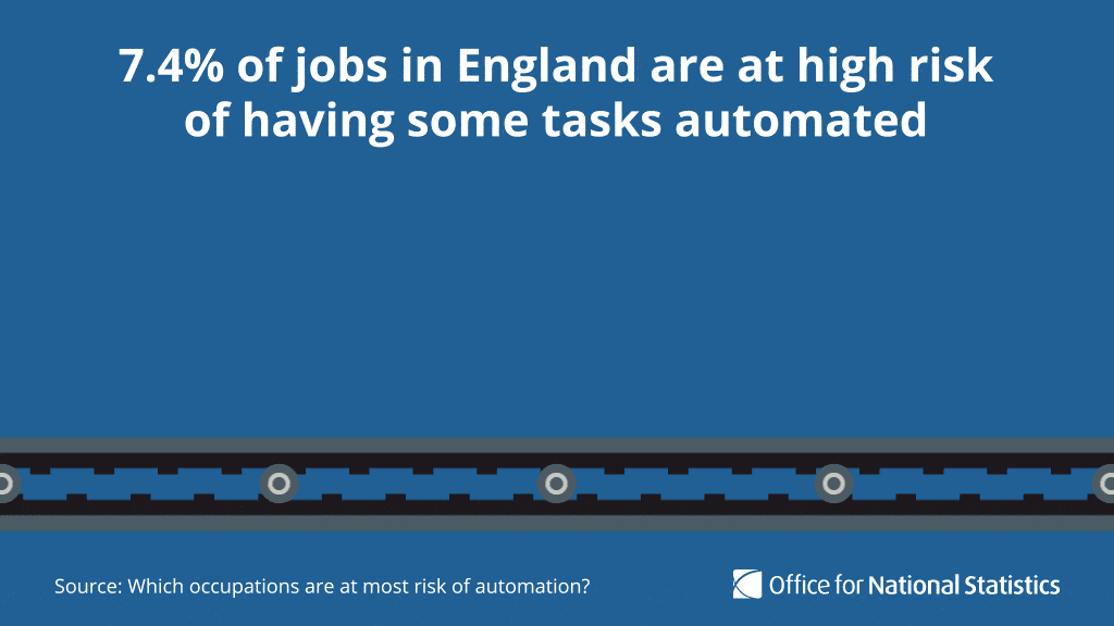
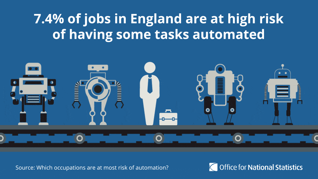
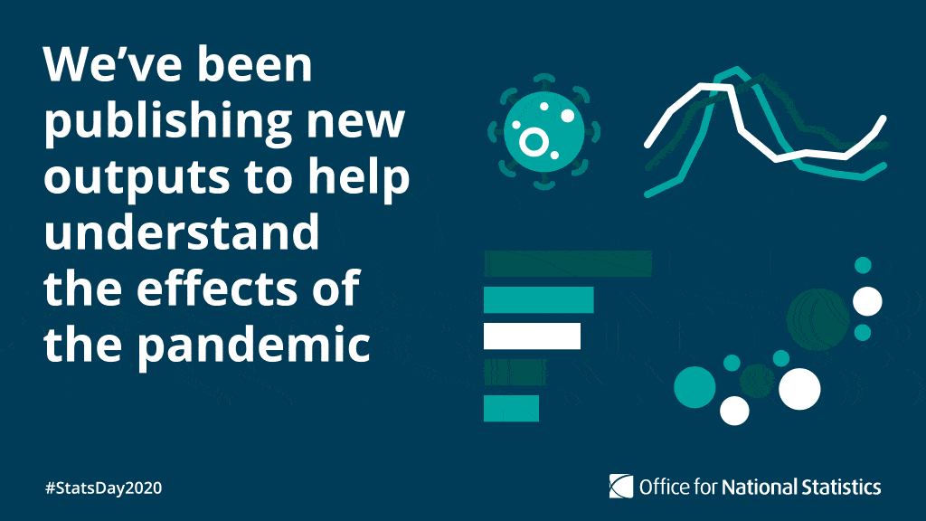
Bespoke illustrations
We use simple illustrations to help support our messaging. These are:
- clear
- simple
- understandable
- based on our iconography style
We have Adobe Illustrator templates for generic graphics, COVID-19 graphics and regular releases. Keeping these consistent helps build familiarity and awareness of regular content.
Take care when illustrating potentially copyrighted or trademarked content and check with your legal team if needed.
There is more information available on our illustration style.
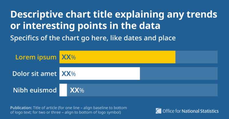
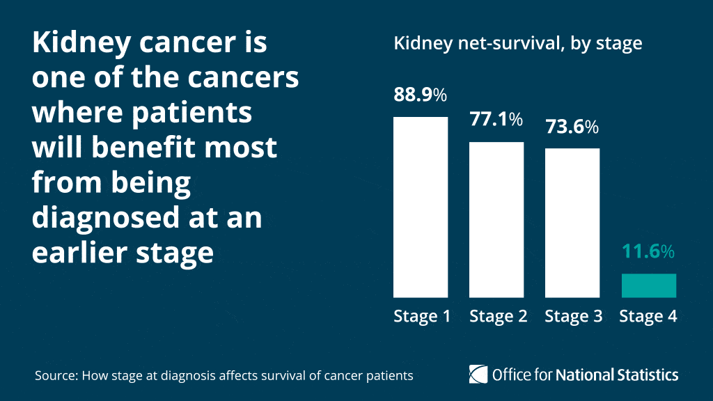
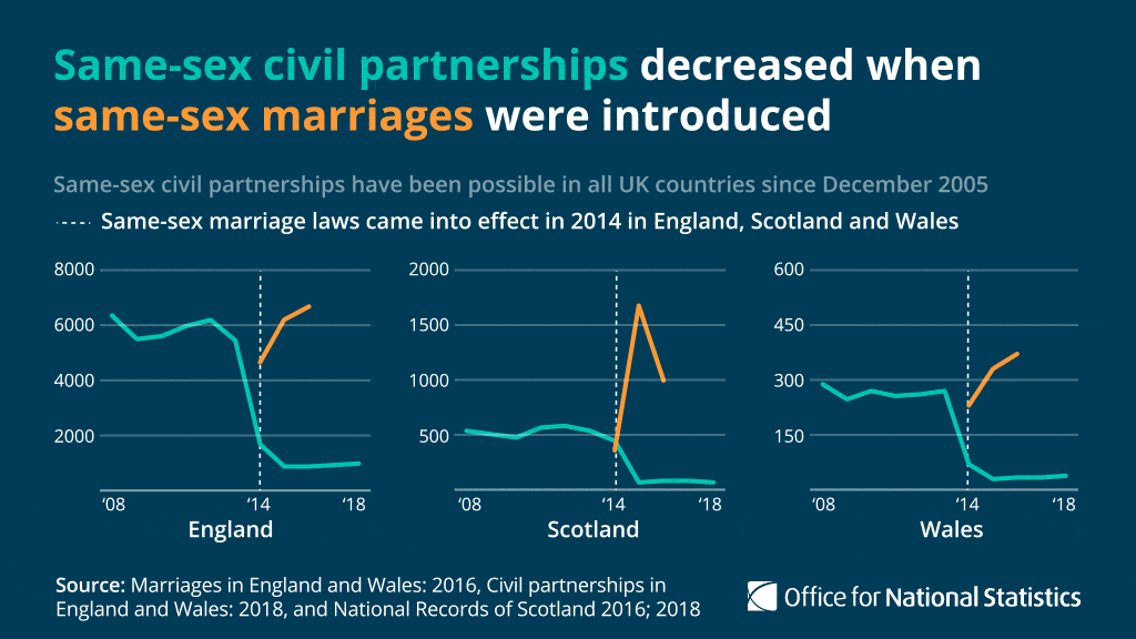
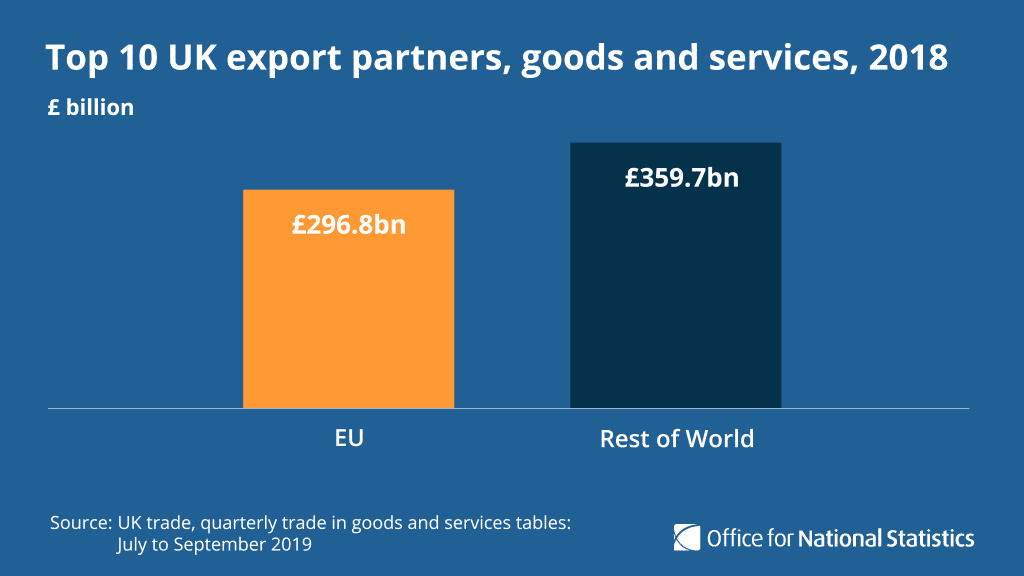
Bespoke charts
When using charts on social media, keep the focus on the data, any supporting imagery is secondary. All charts in our social media graphics follow the Government Analysis Function's data visualisation guidance (opens in a new tab)
Text in charts should:
- follow Government Analysis Function guidance on chart titles (opens in a new tab)
- be displayed horizontally so that it is easy to read
- have the y axis label reflected in the title, to avoid repetition
- be no smaller than 18-point on an artboard of 1024 by 576 pixels
When designing a chart:
- keep the area behind it clear from background graphics
- simplify the axis labels as much as possible by taking out some of the points
- avoid footnotes where possible, use annotations if extra information is needed
- include the source of the article, so the user can find the data for further reading

Bespoke animations
We can animate illustrations, charts and important figures to help increase engagement and bring stories to life. Consider whether the value of creating an animation is proportionate to the effort needed.
Animations should be:
- used as the first tweet in a thread, otherwise there often is not enough engagement to justify the time spent on it
- simple, without exaggerated transitions or movements
If you are making a GIF, duplicate the last frame and put at the start with a 0.3 second duration. This means it will still show the figure with a play button at the start, so users can still see the content if they cannot play the GIF.
GIFs should be under 5 megabytes (MB) for social media to post using Hootsuite. GIFs up to 15MB can be posted manually but cannot exceed this file size.
The ONS design team has an After Effects template for creating animations. There are pre-sets for exporting using Media Encoder, to MP4 for Facebook and GIF to take into Photoshop for Twitter. To request this, email ons.design@ons.gov.uk (opens in a new tab)
For further guidance on creating accessible video and audio content, visit the W3 guidance page on audio and video media accessibility (opens in a new tab)


Animating charts in Adobe After Effects
We use Adobe After Effects to create animated charts for social media.
Line chart
To create an animated line chart:
- Select "Layer", "New", "Shape Layer".
- Open the dropdown menu for the new shape layer and select "Add", then "Path".
- Open the dropdown menu for "Path" and select the stopwatch button. Create a line in Illustrator and paste in here.
- Select "Add" again and then “Stroke”.
- Open the dropdown menu for "Stroke" and set the "Line Cap" and "Line Join" to "Rounded". Change the stroke width to 5px.
- Select "Add" and select “Trim Paths”. Open the dropdown to set "End" to 0% and select the stopwatch.
- Choose the point you would like the line to stop animating and set the end value to 100%, depending on the direction of your line. You may instead have to set the start to 100% and 0% respectively.
Using branding from other organisations
We do not often include branding from other organisations, but we can use it if appropriate when creating graphics for awareness or topic days.
We can do this by:
- introducing the logo in isolation at the start of a thread within our design template, such as for our University Mental Health Day Twitter campaign (opens in a new tab)
- using styling and assets that are supplied by the organisation to introduce the day, such as for our International Women's Day Twitter campaign (opens in a new tab) and our World Statistics Day Twitter campaign (opens in a new tab)
Help improve this page
Let us know how we could improve this page, or share your user research findings. Discuss this page on GitHub (opens in a new tab)