Illustration
Overview
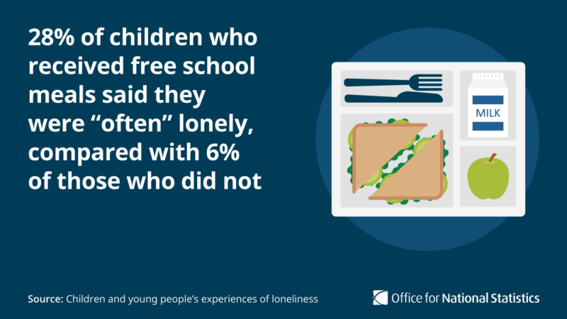
Our illustration style helps to tell a story by using flat graphics in compositions of everyday objects, buildings, and people. We aim to support text with appropriate imagery, so our illustrations keep detail to a minimum and are rarely used simply for decoration.
Illustrations and icons
Our illustrations are designed to reflect larger, more detailed forms of Office for National Statistics (ONS) icons.
When space allows, we can scale up icons to illustrations to offer a richer user experience and make the ONS brand easier to recognise.
Illustrations are used both alongside our icons, and separately, where icons cannot tell the story alone. If icons make up part of a larger illustration, they should change in style to match.
Our style
We draw our illustrations in a flat graphical style that uses subtle shadows on objects, to create the illusion of depth and create differentiation. They use semi-realistic shapes with a slightly looser, less fully geometric style than our icons.
Colour
ONS illustrations should use accessible colour combinations, in line with W3 guidance on colour contrast (opens in a new tab)
Exceptions are made where illustrations are purely decorative or are part of a picture that contains significant other visual content.
We use the following reduced colour palette for illustrations as much as possible. However, where a greater degree of reality is needed (for example, for food or the sun), we may use other colours from the brand colour palettes.
When illustrating people, we use our people tone palette.
Night blue
- RGB
- 0, 60, 87
- CMYK
- 100, 39, 0, 63
- Pantone
- 2188 CP
Ocean blue
- RGB
- 32, 96, 149
- CMYK
- 93, 51, 6, 4
- Pantone
- 2151 CP
Sky blue
- RGB
- 39, 160, 204
- CMYK
- 86, 8, 0, 0
- Pantone
- 299 CP
Spring green
- RGB
- 168, 189, 58
- CMYK
- 26, 1, 100, 10
- Pantone
- 583 CP
Leaf green
- RGB
- 15, 130, 67
- CMYK
- 87, 0, 99, 32
- Pantone
- 2259 CP
Grey 100
- RGB
- 65, 64, 66
- CMYK
- 40, 30, 20, 66
- Pantone
- Cool Grey 10 CP
Grey 75
- RGB
- 112, 112, 113
- CMYK
- 54, 43, 42, 20
- Pantone
- Cool Grey 9 CP
Grey 35
- RGB
- 188, 188, 189
- CMYK
- 30, 22, 22, 3
- Pantone
- Cool Grey 7 CP
Grey 15
- RGB
- 226, 226, 227
- CMYK
- 14, 10, 10, 0
- Pantone
- Cool Grey 4 CP
Grey 5
- RGB
- 245, 245, 246
- CMYK
- 5, 4, 4, 0
- Pantone
- Cool Grey 1 CP
Building compositions
Compositions can be created by arranging objects, people and iconography.
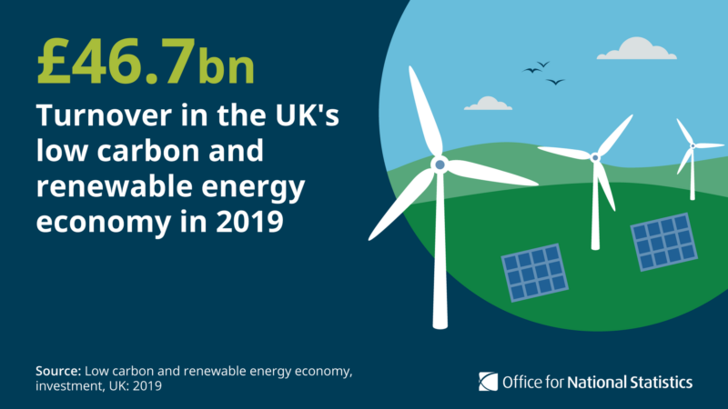
Objects in the backgrounds of scenes, such as trees, can be created as grey silhouettes to add depth. Scenes such as these can be used to tell stories in an editorial setting where more detail is needed and space allows.
For social media illustrations we use circles to help root the image with its background. As with icons, the circle acts as a containing frame - with illustrations we can break this frame to add interest.


Objects
We use scale and colour to create the illusion of depth within illustrations, rather than creating 3D objects with perspective and detailed shading.
Illustrated objects can be used as standalone items to represent topics or grouped together to make up a larger composition. Shadows added below these objects helps to route them in their surroundings. Shadows should be one shade darker of the background colour.
Where possible, objects should have rounded corners to create the impression of friendliness. Lines, such as the stems of leaves, stroke joints and end caps should also be rounded.

People
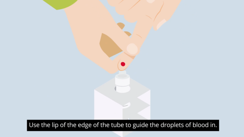
We use people and close-up imagery in illustrations to help tell stories and give clear instructions. Our illustrations should represent our society, showing a diverse range of ages, genders, ethnicities, religions and abilities.
People are built in a modular way to allow for easy manipulation and a range of poses. This also makes animating these characters easier and allows for a great range of lifelike motion.
For more sensitive data releases, such as death statistics, we avoid the use of people and aim to tell the story through the combined use of text, icons and objects.

Using shadows can define certain areas, such as the background, fingers and facial features. The following method can make colour selection easier for shadowing:
- if using skin tone 3 for the main skin tone, select skin tone 5 for the shadow detail
- if using skin tone 5 for the main skin tone, select skin tone 7 for the shadow
detail - use black for eye colouring, create with a simple round ended stroke of 1px
and use a circular shape for the iris
The people tone palette can also be used for hair colours.
Help improve this page
Let us know how we could improve this page, or share your user research findings. Discuss this page on GitHub (opens in a new tab)