Visual concept
Overview
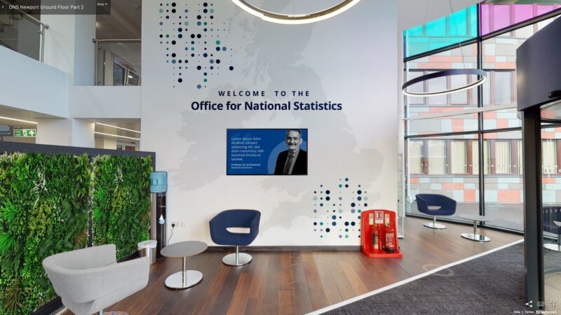
The ‘dot’ visual concept
We are taking the most basic representation of data, a dot, and turning it into an identity fit for the Office for National Statistics (ONS).
The dot can be applied to print and digital communications, both within a grid and breaking out of it. The dots make up a toolkit of graphic elements that can easily be applied to form recognisable ONS brand materials.
Circles are a common feature of identity design that are used by many of the world’s leading brands. They can be used to convey:
- positive emotional messages (circles seem softer and more welcoming than harshly angled shapes such as triangles)
- unity and commitment (people relate rings to the idea of marriage)
- strength and steadiness (circles are consistent and sturdy)
Applying the concept
In recent years, branding of ONS materials has centred around different uses of circles and dots, such as those used for the Census 2021 campaign.
Dots are now a part of a coherent identity for the ONS, we use a grid pattern and circle holding shapes.
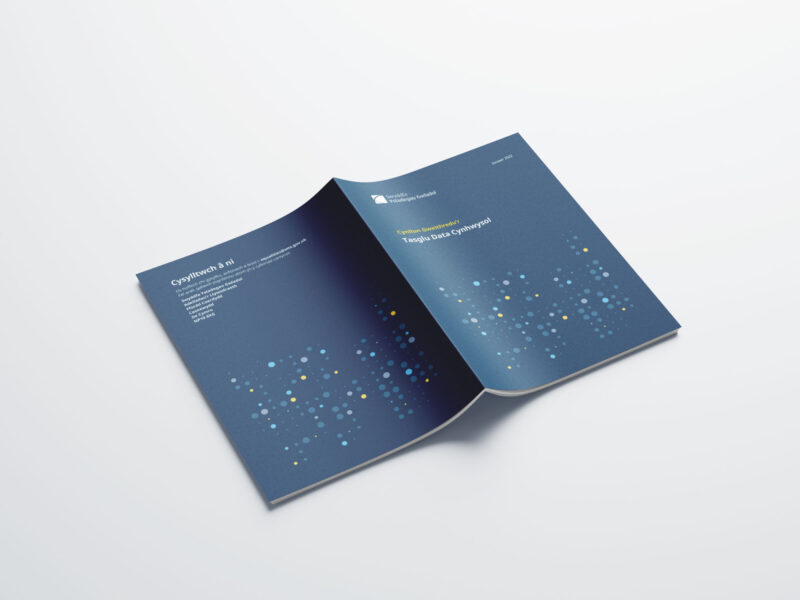
Grid pattern
A grid of dots that uses scale to represent numbers 0 to 15 in binary to produce a seemingly random pattern that still feels structured.
Basing the pattern on data ties in with our purpose of producing and presenting statistics.
The pattern is flexible, you can:
- repeat it to cover larger areas
- use it in a variety of colours
- crop and scale the full dot pattern
- remove dots from the pattern to create interesting shapes


Colours
On ONS branded material, you should use the primary brand colours.
However, for some campaigns you can include the extended palette.
We have created different versions of the pattern using these colour palettes:
- mono colour – work well for backgrounds and larger repeating areas
- two-tone – for creating campaigns where it is suitable to differentiate from general ONS branding
- multicolour solid – used in cuts of the pattern to add visual interest to artwork (do not use more than five colours)
The pattern can be applied on dark or light backgrounds, using full colours or one of the tints in the ONS palette.


Sizing and spacing
The scale of the dots is evenly stepped in four sizes – 25%, 50%, 75% and 100% of the largest dot.
The spacing between two of the largest dots is 50% (the size of the second smallest dot).
For example, on an A4 document, the dots:
- are 2mm for the smallest size
- are 8mm for the largest size
- have spacing of 4mm and 6mm in between
The gap between two largest dots is 4mm.

Dots as shapes
Circles can also be used as:
- layout elements to add visual interest
- background decoration
- holding shapes to "ground" illustrations and photography
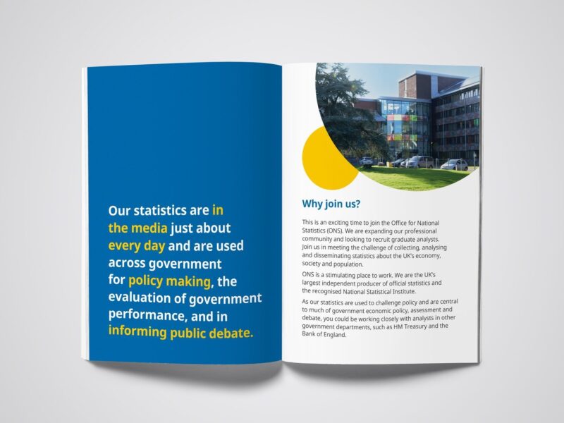


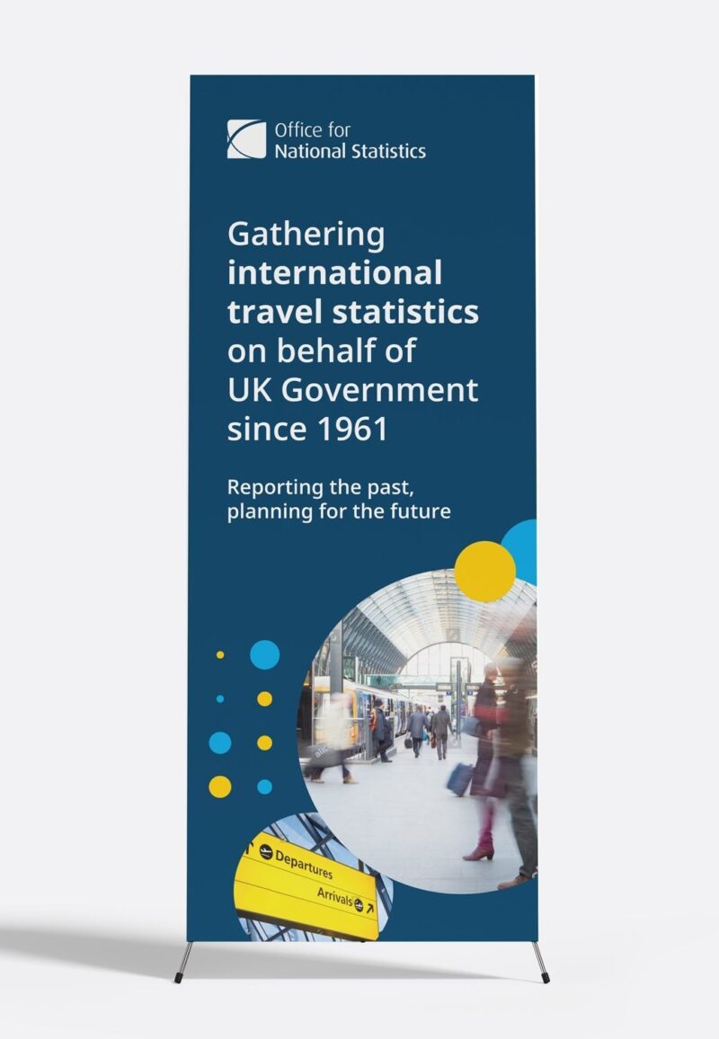
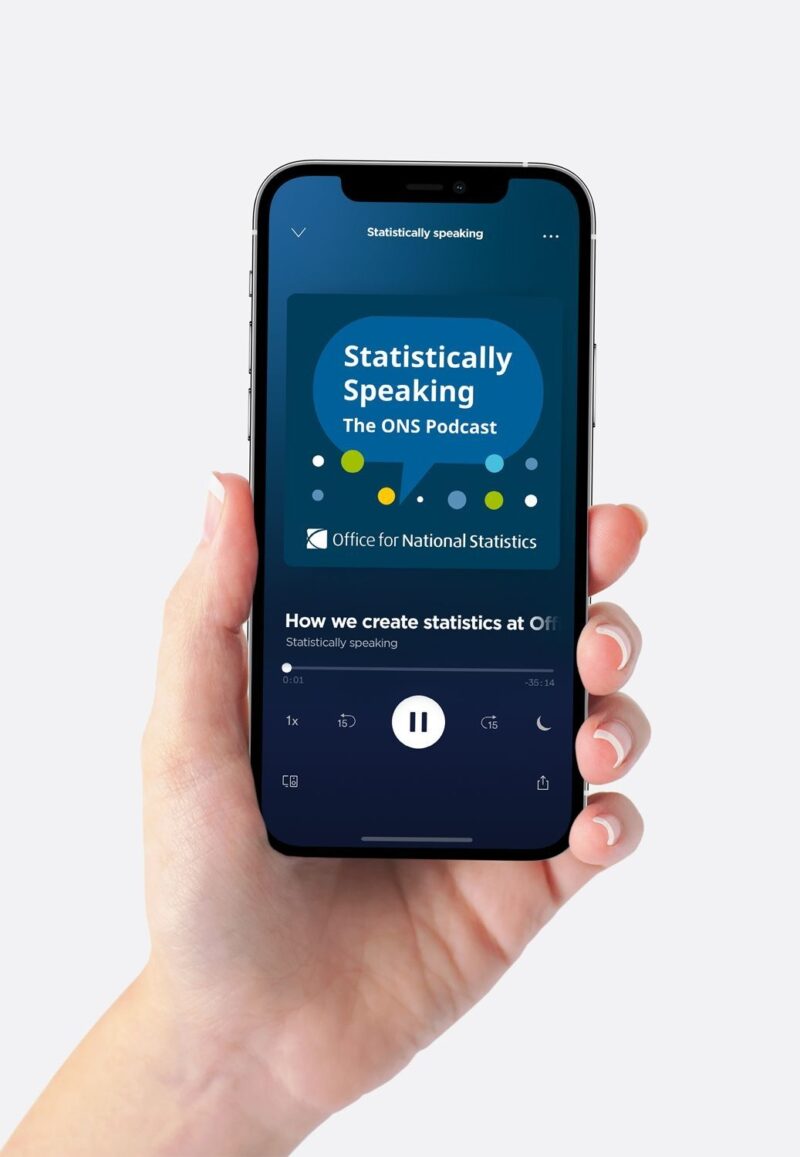
Examples of the ‘dot’ in use


Help improve this page
Let us know how we could improve this page, or share your user research findings. Discuss this page on GitHub (opens in a new tab)