Our brand
Overview
This page summarises the essential information to give you a flavour of our visual identity.
Brand elements
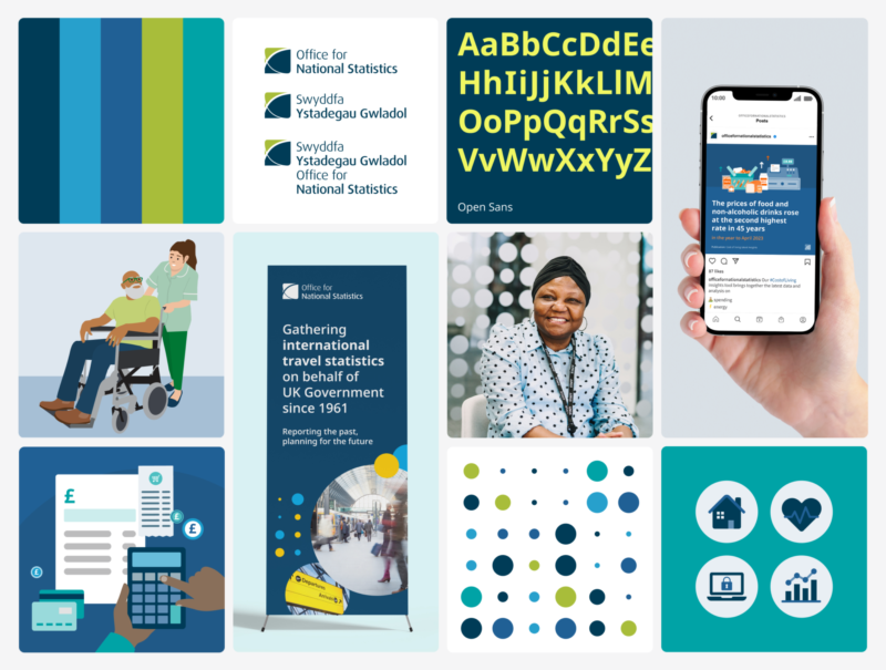
Many elements make up the ONS brand, including our logo, typography, colours and imagery.

Logo
Our logo is available in English, Welsh and bilingually, with landscape alternatives. Make sure there is enough clear space around the logo when applying it in print or digital formats.
Do not alter, redraw or modify the logo in any way.
Find out more about using our logo
Typography
Our primary typeface is Open Sans, which should be used across all print and digital communications. We have alternative and translation typefaces available.
Read more about using our fonts and text styles
Colours
Our core brand colours have been built out from our logo colours. We have additional supporting palettes for digital products, illustrations and charts. We use tints of our colours to add depth to the colour palette.
Explore our brand colour palettes and their usage
Visual concept
Our visual concept centres around a simple dot, the most basic representation of data. We have created a pattern based on a data dot grid with differing scales and colours.
We apply dots in flexible ways to our materials, using full blocks or cuts of the data pattern, or using circles as framing shapes and decorative elements.
Find out how we apply our visual concept
Iconography
We have created a library of icons for use on our materials.
Our icon style uses geometric shapes and rounded corners. There are three icon sizes that have been optimised for different uses.
Read about how to use our icons or view our icon set
Illustration
We have developed an illustration style to support our written content, where appropriate. Our illustrations use a flat, semi-realistic graphical style with restricted colour palettes within each scene or spot illustration.
We are building a set of characters to bring illustrations to life.
Understand our illustration style
Photography
We use photography to reflect the diversity of the UK population and add authenticity to our materials. Images should show real people from a mix of ethnic backgrounds, gender expressions, ages and other characteristics.
Learn more about our photography style
Brand application
We combine different brand elements to project a coherent feel across all media, whether print, digital or physical spaces.