Chart elements
Overview
This page sets out styles for chart elements, including gridlines, legends, and annotations. It is important to stay consistent with these styles to maximise legibility of the charts and brand recognition.
Do not add any other chart decoration, such as borders or backgrounds, as these distract users from the data and message.
Gridlines
Most charts should include gridlines to help users read the data and understand the scale. Read more about how and when to use gridlines in our axes and gridlines guidance.
Gridlines should be placed behind other chart elements. Axis text styles can be found in the chart typography page.
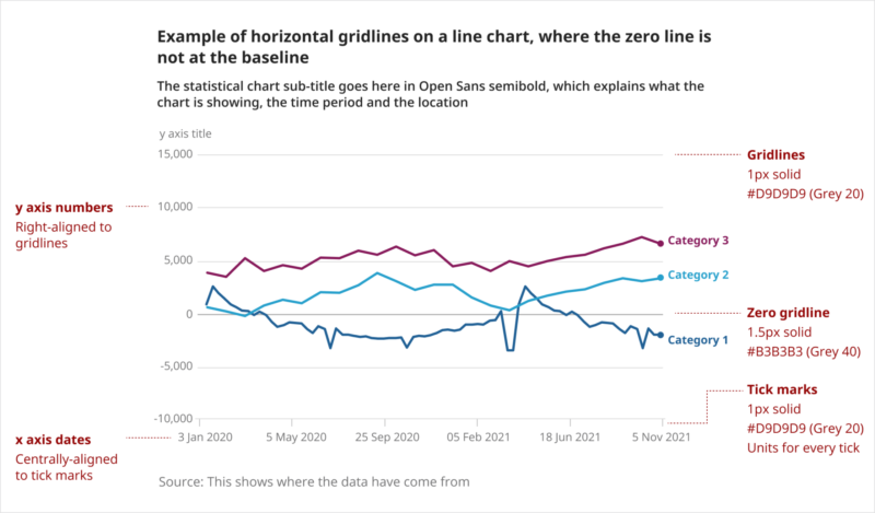
Default styling of gridlines is shown in the following example line chart:
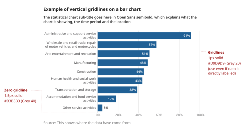
Bar charts should include gridlines, even if the data are directly labelled on the bars, as shown in the following example:
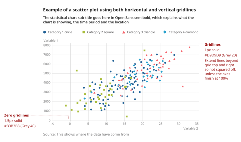
Most charts do not need both vertical and horizontal gridlines. An exception to this is scatter plots.
For scatter plots, unless the axes total 100%, extend the lines beyond the grid at the top and right side, so the grid is not squared off, as shown in the following example:
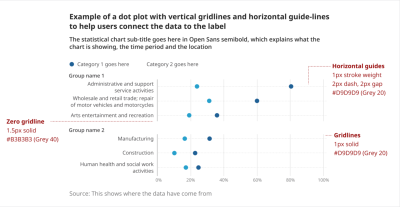
As well as gridlines, dashed horizontal guidelines can be added for certain charts, such as dot plots. These help to visually connect the data to the label, as shown in the following example:
How to style and format gridlines
| Item | Stroke weight (pixels) | Stroke style | Colour name | Colour values |
|---|---|---|---|---|
| Zero gridline | 1.5px | Solid line, square cap | Grey 40 | #B3B3B3 179, 179, 179 |
| All other gridlines | 1px | Solid line, square cap | Grey 20 | #D9D9D9 217, 217, 217 |
Tick marks1 | 1px | Solid line, square cap | Grey 20 | #D9D9D9 217, 217, 217 |
| Guidelines | 1px | Dash 2px, gap 2px, square cap | Grey 20 | #D9D9D9 217, 217, 217 |
Notes
- Categorical axes should not have tick marks
Legend
Where possible, it is best to use direct labelling to indicate the categories, such as in line charts. However, for most charts this may not be practical, so we use a legend.
Legend text styles can be found in the chart typography page.
Legend position
The legend should be above the chart, aligned to the left-hand side of the chart area. It can extend to the right-hand side of the chart.
Legend labels should run along the same line (wrapping on to following lines, as needed) and not be stacked vertically. Text within each label should be kept on the same line – move the whole label to the next line if it does not fit.
Legend symbols
Circles and lines
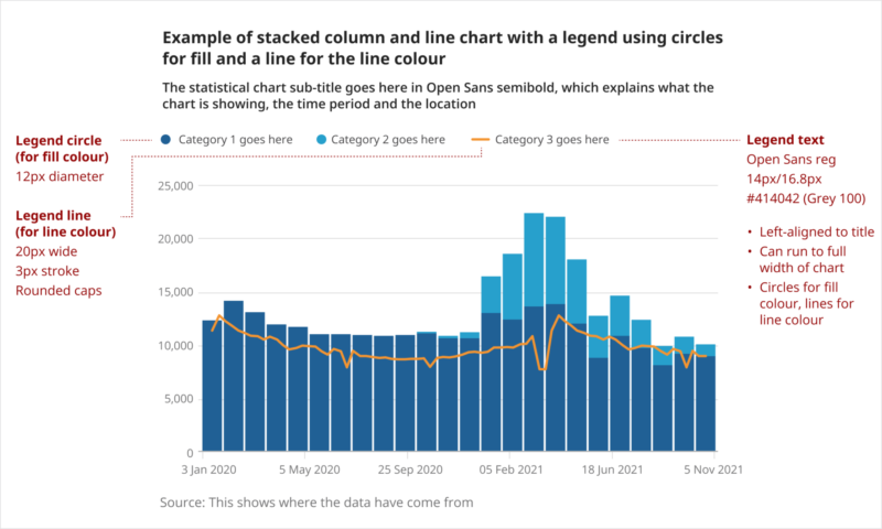
- Circles are the default legend shape for fill colour, for example, bar charts, area charts, dot plots.
- The circles should have a 12-pixel (px) diameter.
- Lines are used for line charts, where these are not labelled directly.
- The lines should be 20px wide, with a 3px stroke weight and rounded caps.
Squares
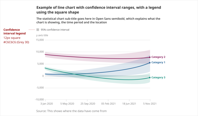
- Squares should only be used for a range, for example, the fill for a confidence interval.
- They should be 12px square, using the colour #C6C6C6 (Grey 30).
- The only other case is when using a square symbol in a scatter plot.
Other shapes (scatter plot)
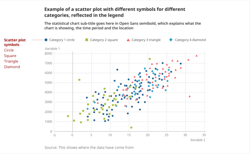
- Where a scatter plot uses different data point symbols, these should be reflected in the legend, with similar sizing to the circles (squares may be smaller in width to account for optical difference).
- The default order is circle, square, triangle, diamond.
Squared reference lines (discrete data)
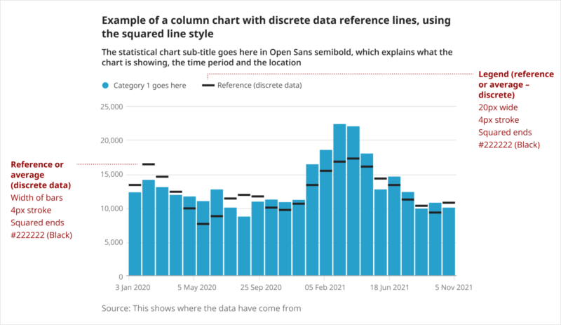
- Use squared lines for discrete data reference lines in column charts.
- The squared lines should be 20px wide, with a 4px stroke width and squared caps.
- The default colour is #222222 (Black).
Annotations
Annotations are used to point out relevant data points and add contextual information, such as significant events or date ranges. Read more about how and when to use gridlines in our annotations guidance.
Annotation text styles can be found in the chart typography page.
Most annotations are used with an arrow to a specific data point, but reference lines and ranges can also be used, as shown in the following line chart example:
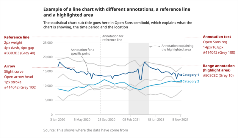
How to style and format annotations
| Item | Stroke weight (pixels) | Stroke style | Colour name | Colour values |
|---|---|---|---|---|
Arrow | 1px | Solid curved line, open arrowhead | Grey 100 | #414042 65, 64, 66 |
| Reference line1 | 2px | Dash 4px, gap 4px, square cap | Grey 40 | #B3B3B3 179, 179, 179 |
| Range annotation (highlight area)2 | Not applicable | Not applicable | Grey 10 | #ECECEC 236, 236, 236 |
Notes
- Used to highlight a significant date or threshold.
- Used to highlight an extended period.